 |
| Hardcover, 267 pages Published 1987 (originally 1900) Acquired January 2011 Reread December 2016 |
pictures by W. W. Denslow
I've been an Oz fan as long as I can remember, but the copy of the first book I had as a kid was kind of rubbish. A 1958 edition from Scholastic, it had new illustrations by Paul Granger obviously designed to remind you of the MGM film versions of the characters-- and even leaving that aside, they weren't very good. So after reading about it (Michael O. Riley discusses it in Oz and Beyond) and hearing about (Anne Philips presented on it at a conference I attended), I knew I needed to pick up a facsimile of the original book, and thankfully I found this 1987 Books of Wonder edition a few years later.
The original book is as much W. W. Denslow's as it is L. Frank Baum's I would argue (and indeed, Denslow and Baum split the copyright, whereas Baum was the sole owner of the later novels illustrated by John R. Neill). The original is an very visual experience. Far from just having pictures occasionally opposite or next to the text like my old Scholastic edition, in the original Denslow's pictures interact with the text. Take for example this illustration from when Dorothy and the Scarecrow find the Tin Woodman in the forest:
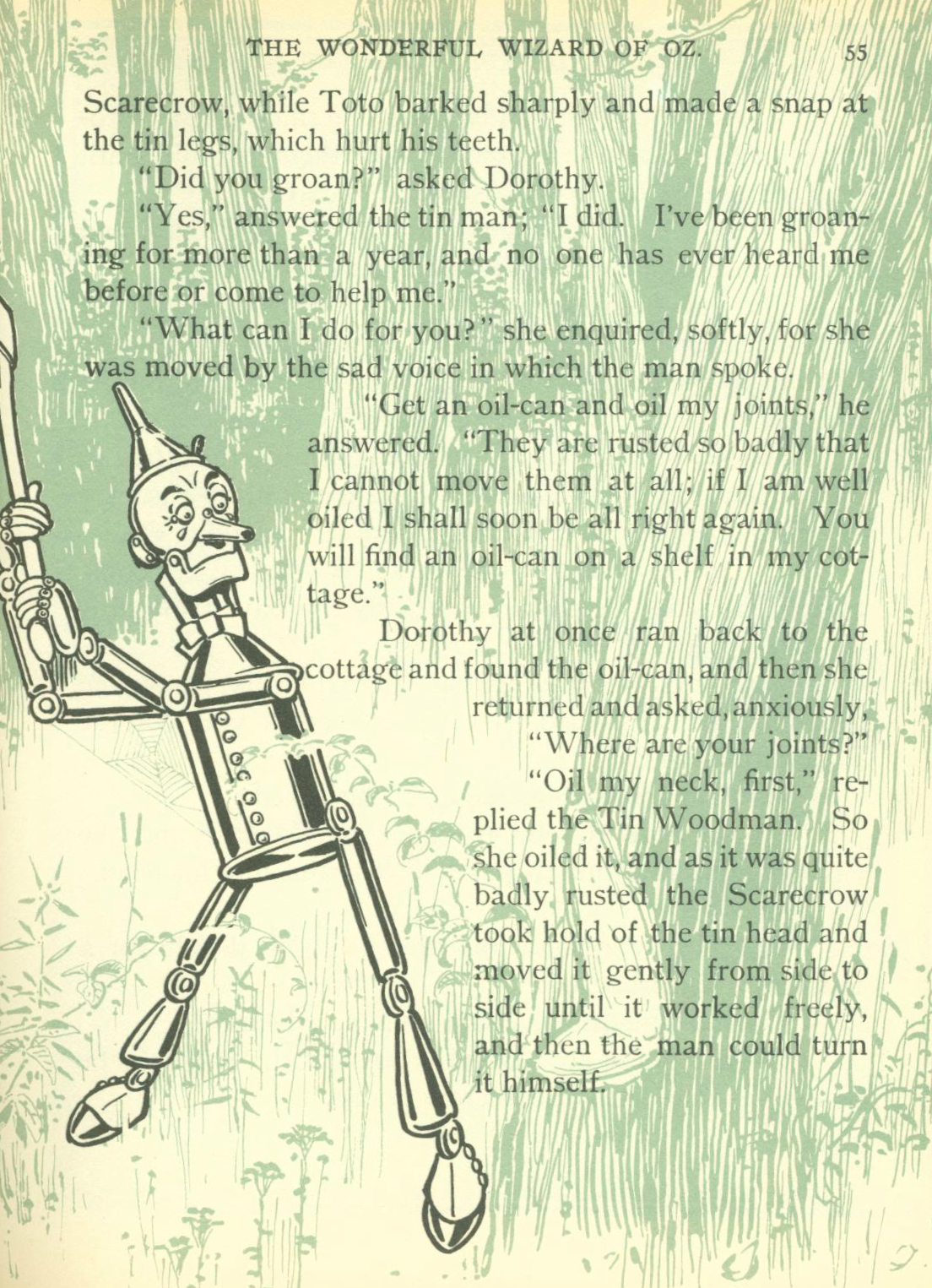 |
| Baum & Denslow (1900), p. 55 |
As you can see, the Munchkin forest doesn't just surround the Tin Man, but it also surrounds the very words of the story itself-- the story is in the woods as much as the characters are. Like a lot of Oz books, the book features both a number of color plates and also black-and-white illustrations on the text pages, but uniquely, the black-and-white illustrations almost all have some kind of color accent. This color shifts throughout the story. You get the dark green above when the characters are in the Munchkin Country (I'm not sure why it's not in blue, though). This becomes light green in and near the environs of the Emerald City:
 |
| Baum & Denslow (1900), p. 116 |
Earlier in the book, in Kansas, a dismal brown was the accent color:
 |
| Baum & Denslow (1900), p. 5 |
And, appropriately, it keeps changing as the novel goes on: a sort of dark yellow as they travel into the Land of the Winkies, brown for the forests of south Oz, and orange-red in the Quadling Country (this color is also used during the poppy field incident). It's a cool touch, and one that as far as I know, the Oz books never made use of again. But this was a lavish edition, intended for gifting, and Denslow's star was arguably bigger than Baum's at the time.
The color plates are great, too. This one of the Cowardly Lion to dinner at a random house on the road is pretty nice, for example:
 |
| Baum & Denslow (1900), opp. p. 114 |
And the green wash Denslow covers the illustrations from the Emerald City chapters with nicely reproduces the effect of the green glasses everyone wears in the book:
 |
| Baum & Denslow (1900), opp. p. 196 |
Denslow's style works to keep Oz safe. As I've discussed before, Baum occasionally describes horrific violence: a lot of creatures fall victim to the Tin Man's axe, and a pair of Kalidahs-- themselves described as "monstrous" (79)-- are even "dashed to pieces" on rocks at the bottom of a chasm (81). Or there's the story the Tin Woodman tells of his own mutilation. But, Denslow never renders this violence directly. The plunging Kalidahs are almost comic:
 |
| Baum & Denslow (1900), opp. p. 80 |
And this is all the illustration we get of the Tin Man killing an army of forty wolves in a nighttime battle:
 |
| Baum & Denslow (1900), p. 142 |
I also like Denslow's cartoony, round-headed people. Almost everyone looks like a little kid in Oz, which seems appropriate. Glinda might be a young woman, but she's one of the only human beings in the book who is actually taller than Dorothy:
 |
| Baum & Denslow (1900), p. 253 |
The witches end up being the only characters with, well, stature, which seems appropriate for the way their capabilities tower across the plot of this novel. I know this draws on the way the Oz characters are described in the text of Wonderful Wizard, but I don't think Baum and Neill maintained these height distinctions in the later Oz novels, and I assume it was one of the inspirations behind casting people with dwarfism as the Munchkins in the MGM film. (Though, why are the Scarecrow and the Tin Man as tall as average human beings when they're both modeled on Munchkin men?)
Each chapter even gets both an illustration with its first word (as with the opening to Chapter XXIII immediately above) and a cool title page of its own, setting the atmosphere for the chapter ahead, like this one:
 |
| Baum & Denslow (1900), p. 85 |
In short, Baum's original text has always been great, but pair it with Denslow's illustrations, and you have a journey into the fantastic that no one will ever be able to surpass. This is the definitive version of The Wizard of Oz and all others pale in comparison.
Next Week: I resume an old reading project, The New Doctor Who Adventures, picking up with the Doctor vs. Hitler in Timewyrm: Exodus!
No comments:
Post a Comment