30 November 2020

Star Trek: The Destiny Era: The Stuff of Dreams

Published: 2013
Acquired: March 2019
Read: October 2020

Star Trek: The Next Generation: The Stuff of Dreams
by James Swallow

2384 ("some months" after The Body Electric)
I can't claim I ever wanted a follow-up to Generations. "What was the nexus?" is a question I never even thought about. But The Stuff of Dreams brings the Enterprise crew back into contact with that phenomenon, several decades ahead of schedule. Instead of passing through local space every 39.1 years, it's returning 25 years early... and coming within the reach of the Typhon Pact, who might like to have some easy access to time travel.

At first, I will admit I really didn't see the point of all this. The nexus (always lower case, which feels wrong to me, like it's just some nexus, when surely it's the Nexus) is kind of a maguffin. The Enterprise has met up with the science vessel Newton, which has been studying the nexus for months; with the nexus about to enter Kinshaya space, the Newton is going to destroy it so that no one can get their hands on it. But there's a saboteur on board: it felt like this could have been any space thing in any Typhon Pact story.

But then Picard returns to the nexus about halfway through the novella, and the story gets wistful and melancholy and true. Picard has to convince another man to give up the fantasies of the nexus while once again confronting his own. The writing is tight and evocative and character focused; as it goes on, it becomes genuinely moving, and I found myself tearing up as I finished the novella over lunch. (Warning: parenthood makes you into a total sap.) The reappearance of a certain Generations character seemed obvious once it happened, but I didn't expect it, and I really like what was done with him. It gave him good closure. Swallow has a good grasp on Picard, and this is the first Destiny-era story to convince me that there's something interesting in marrying Picard off and giving him a family, the first one to tell a story that could not have been told before.

And, I must admit, the more thriller-focused elements in the first half work well; the culprit seems obvious, so I was surprised to be wrong-footed. (And then Swallow puts a second surprise on top of the first-- sneaky!)

It's quick, and that's to its advantage. One of the things I like about these novellas is that they read like episodes of the television series; Destiny-era fiction can often feel bloated, but The Stuff of Dreams gets right to it and never really wastes any time. It kind of makes me think all Star Trek tie-in fiction should be novella-length! Another thing I like is its perspective. A lot of Star Trek books jump from character to character to character in a way that makes it hard for the book to maintain any real throughlines; the choice of viewpoint feels like it says more about the plot than anything else. The Stuff of Dreams focuses primarily on Picard, using him as the focal character for the majority of its scenes. But not every scene is a Picard one; we'll segue into Worf or whoever when it's needed, but we always quickly come back to Picard. So while this might read like an episode in terms of pacing, in terms of character focus, I think it plays to the strengths of prose instead of trying to emulating tv-style ensemble storytelling.

So despite my initial skepticism, this turned out to be nice little adventure of the kind I wish we saw more of. I think all of Swallow's Destiny-era books were Titan ones outside of this, so it's nice to get to see him do something different. I'd like to read more TNG by him.

Don't worry, these guys don't come back.
Continuity Note:

  • One character, Kolb, is an old friend of Picard; it's mentioned they met when the Enterprise-D saved his planet, Styris IV, from Anchilles fever. I vaguely recognized those names, so I assumed he had appeared on some old episode of TNG that I had mostly forgotten. I was surprised when later I discovered he was an invention of this book-- Styris IV was where the Enterprise was going after "Code of Honor." I do wonder if there's a pre-established character Swallow could have used again to give things slightly more oomph. I am not a huge fan of the never-before-mentioned-old-friend trope!

I read Destiny-era Star Trek books in batches of five every few months. Next up in sequence: Department of Temporal Investigations: Shield of the Gods by Christopher L. Bennett

25 November 2020

Review: Doctor Who: The Fountains of Forever by Nick Abadzis, Elena Casagrande, Eleonora Carlini, Rachael Stott & Leonardo Romero

Collection published: 2015
Contents originally published: 2015
Acquired: September 2018
Read: October 2020

Doctor Who: The Tenth Doctor, Vol 3: The Fountains of Forever

Writer: Nick Abadzis
Artists:
Elena Casagrande, Eleonora Carlini, Rachael Stott & Leonardo Romero

Colorist:
Arianna Florean

Letters:
Richard Starkings and Jimmy Betancourt

This volume wraps up "Year One" of Titan's ongoing tenth Doctor comic; if the opening volume was a highly effective pastiche of a Russell T Davies new-companion episode, this is a very dismal one of a Russell T Davies season finale. The Doctor and Gabby return to Gabby's home of New York City, and even though Gabby's friend Cindy gets swept up in events, none of it matters. There's no sense of personal investment here-- this story isn't about the Doctor or Gabby or Cindy in the way that "The Parting of the Ways" was about the Doctor and Rose and Jack and Mickey and Jackie, or that "Doomsday" was about the Doctor and Rose and Mickey and Jackie and Pete, or that "The Last of the Time Lords" was about the Doctor and Martha and Jack, and so on. Nothing is at stake here for our main characters, they're just participants. This could at least be a story about Gabby and Cindy's friendship, but mostly Cindy is just an extra person to stand around in scenes where lots of people stand there while the Doctor talks. (Nick Abadzis anticipated the storytelling tics of the Chibnall era, I guess.)

It just feels like a random standalone adventure except for the attempt at scale. The universe is threatened-- but so what? The Osirans from Pyramids of Mars return-- but so what? Your boring bad guy from a boring story being related to an interesting bad guy from an interesting story doesn't make him interesting. I found it very hard to get invested in whether this guy should go through some portal, and without the period trappings, the Osirans are pretty generic super-beings.

from Doctor Who: The Tenth Doctor #12
(art by Elena Casagrande & Eleonora Carlini)
Despite all this, and despite involving four different people, the art is pretty consistent and mostly very good. I'm not sure about the occasional manga-esque effect (they're so occasional it jars), but at least Gabby looks like a Hispanic woman again. These artists could be supporting a stronger story is all.

I was disappointed because I thought the first volume of The Tenth Doctor had real potential. The second was meh-- but it had a different writer, so I could accept that, and figured that when the original came back, things would be better again. Hopefully "Year Two" gets things back on track.

I read an issue of Titan's Doctor Who comic every day (except when I have hard-copy comics to read). Next up in sequence: The Twelfth Doctor: Hyperion

23 November 2020

Star Trek: The Destiny Era: Department of Temporal Investigations: Time Lock

Published: 2016
Acquired: February 2019
Read: September 2020

Star Trek: Department of Temporal Investigations: Time Lock
by Christopher L. Bennett

July 2384March 2385
On the strength of The Collectors, I was really looking forward to reading Time Lock, but while Collectors was energetic and inventive, Time Lock is-- like the two DTI novels-- plodding and over-expository. Things get off to a rough start with a confusing sequence where people tell each other and/or think about a time portal recovered from the Gum Nebula, the political configuration of the Vomnin, the events of Titan: Orion's Hounds, how the Vault works, and the identities of a bunch of different DTI characters. People think to themselves, "better not be pedantic and say x," and think about x instead, which I will say is not really an interesting to smuggle in exposition that actually doesn't add anything.

I like the idea of this book, but it never takes off. That the DTI could be subject to a heist where each side uses temporal devices against the other sounds fun, but it ended up in practice being dull. Too often the DTI characters do something clever but obscure, and then it is explained to us what was done, meaning a lot of the action is retrospective and detached, which prevents us from feeling invested in it. The villain is a bit on the cartoony side, and I will admit to not strongly caring about any of the original DTI characters.

The idea of the time lock is clever: within the Vault, time keeps slowing down, so at first the Vault is a minute behind, then it's 20 minutes behind, then forty, then an hour; by the novella's end, only a couple days have passed inside the Vault, but eight months have gone by outside! This is clever, yes, but it does mean that any sense of urgency completely evaporates when the action switches to outside the Vault. Oh no, will the DTI figure it out? Well, yes, because they have months to investigate it at their leisure, actually. And these scenes are often bogged down by exposition, too, such as a long and pointless explanation of stepwells.

The problem is that the longer the book goes on, the more time the outside characters have to solve the problems inside the Vault. The end of the book tries to raise the stakes by having something go horribly wrong, but it feels arbitrary in its deployment of technobabble: suddenly it's "blah blah subspace" and the tension is just draining away. And then the resolution comes from the outside characters having months to research something that will save the inside characters.

It did have its moments, but based on The Collectors, I expected quick-fire time shenanigans as the two groups tried to outwit each other. Instead I felt like each side had just two ideas that were doled out very slowly. The end promises a sequel, which doesn't leave me very excited. (But for me, different time shenanigans with the nexus are coming first!)

from Star Trek: The Next Generation Annual #6
(script by Michael Jan Friedman, art by Ken Save & Sam de la Rosa)
Continuity Notes:

  • At one point there's a recap of Orion's Hounds that is (on my Kindle settings, at least) a whole page long. I have read that book and this still confused me, but I think it could have been cut with no problem.
  • There is a reference to the appearances of the rouge Aegis agents in DC's 1990s comics (previously reviewed by me). I know the novels have been using the term "Aegis" from those comics since Assignment: Eternity, but is this the first time any actual events from those comics have been referenced?
Other Notes:
  • One thing I found really weird is when two DTI agents go to check out the home planet of the antagonist: "We investigated her people, the Tomika. There was no sign any of them would have the knowledge or the desire to participate in something like this. And none of them seemed to have the unusual strength and perception she's shown." They checked out an entire sapient species and none of them were interested in stealing time technology? It's a pretty improbable statement, I felt.
  • There's an okay gag where someone is "aged to death" and instead of living until seventy, he died right away because, duh, he doesn't have any food or water. As soon as I read it, I thought of the Babylon 5 episode "Babylon Squared" because this trope has bothered me every since I saw that episode-- and upon reading the author's annotations, Bennett was thinking of that ep himself. But I think the moment is clunky (someone says that it always works in the holodramas, but I got it before then), and it's undermined by the fact that the victim doesn't actually die.
  • I am delighted to report a complete lack of workplace sexual harassment in this DTI installment.

I read Destiny-era Star Trek books in batches of five every few months. Next up in sequence: The Next Generation: The Stuff of Dreams by James Swallow

20 November 2020

The Title Fonts and Logos of Star Trek, Part II: Television and Film, 1987-2003

Continued from last week's discussion of the original tv show and films, Deep Space Nine, and Voyager...

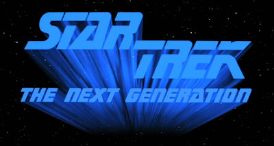
The return of Star Trek to the small screen with 1987's premiere of Star Trek: The Next Generation brought with it a new logo with a new font... the most 1980stastic of fonts:


I know people who hate this typeface for its period-ness with the burning passion of a thousand suns; I've never had a strong opinion on it because, like the fonts for the original, it's been the font of Star Trek: The Next Generation as long as I can remember. That's just how the TNG logo looks, how could it look otherwise? (More on that in, uh, part IV, I think.) It doesn't even look very 1980s to me, to be honest. In the process of researching this post, however, I came across a fan-made font that retro-engineers what a non-italicized version of it would look like.

Defamiliarize it like that, and suddenly my reaction is, "Wow! That is so 1980s... and kinda bad." (In fairness to the real font, I should point out that this guy 80s it up a bit: the real one doesn't have the gap in the S, for example, and he makes the corner of the A more square than it ought to be. Also in fairness to the real font, they knew not to use the gaps in the subtitle.)

The TNG font was never used on any other Star Trek productions.

(Weirdly, though, just days after publishing this, I was reading DC Cybernetic Summer #1 (Sept. 2020), when I suddenly recognized the A in the cover blurb... it randomly uses the TNG font for its blurb! That's the subtitle version, so it doesn't have the horizontal gap in it, but once you notice the A, it's obvious. How random.)


When The Next Generation went to the big screen with 1994's Star Trek Generations, "Serpentine" was the font of choice for the words "Star Trek" on the poster. This is the first time that a Star Trek used an off-the-shelf font for a logo instead of a bespoke one, and it can be seen in a plethora of logos for other tv shows and films, including Lethal Weapon (1987), Tomorrow Never Dies (1997), and InuYasha (2002). I always think primarily of Babylon 5 (1993) when I see it: 

Babylon 5 also used it to display its credits, so it's a pretty strong association.

The later Next Generation movies largely kept up this trend:

As you can see, the first three all paired Serpentine with a narrow sans serif, and then Nemesis with something Yves Peters calls, "a digitally stretched Handel Gothic-like font." Peters also says, "Serpentine shares the (almost) monoline aspect and the tiny triangular serifs with the original movie lettering, but its squarish structure projects a far less elegant, more brutish image." The subtitle fonts adds to that brutish impression in all four cases. I don't think any of these will ever be my favorite Star Trek logos, but I do like the contrast, especially in the Generations one. (I think I have a lot of nostalgia for that movie-- less the movie itself, and more the marketing, since that was the first Star Trek movie release I was really cognizant of. I had the YA novel, and the MicroMachine set, and a couple action figures.)

As with the original films, the TNG ones used different logos within the actual movies, but in these cases they're completely different, with no fonts in common with the poster logos at all. The first two films used ITC Benguiat, a classy serif font:


I think it's that cross-bar on the "A" that I really like. (Fun fact: ITC Benguiat is actually the font used in the Stranger Things logo!) These logos were not, as far I know, used on any merchandising or tie-ins for the films-- but ITC Benguiat was used as the typeface for the logos on the Star Trek: Destiny novels in 2008, in a style imitating the arrangement of the Generations logo.

Insurrection used a different but pretty similar serif font, ITC Elan, for the "STAR TREK" part of the title, though I like it less:

I don't think ITC Elan has been used elsewhere in Star Trek. The sans serif used for "INSURRECTION" is pretty bland.

Star Trek Nemesis introduced, however, a flat-out abomination for its film logo:

Like, what in hell is that? A backwards "R" and "E"?? Why??? It looks too hard like it's trying to be "kewl"; is this born of the same thought process that gave us the dune buggy chase???? It's a font called "Exocet," which was until 2006 the typeface of the Tazo tea logo.

Watching it in the actual film, which you can do here (the logo begins to appear at 00:34), is even worse. I think they're going for something involving mirroring, a theme that is (like much in the film) half-assed, but I don't think it really works. I was pretty amazed to discover that this title sequence is by Richard Greenberg... the man who also came up with literally the greatest title sequence of all time in Superman: The Movie! I guess they can't all be winners.

This logo has never been used anywhere else.


The last pre-CBS All Access television show was Enterprise in 2001 (not Star Trek: Enterprise until, weirdly, the third episode of season three in 2003).

This logo is pretty neat, because the font here is original to Star Trek, even though it had never been used in a logo before. It's actually an adapted version of the font used for the hull markings on most Starfleet vessels since Star Trek: The Motion Picture:

The major change is that it doesn't have the outline that characterizes "Starfleet Bold Extended" (also known as "Millennium Bold Extended"), itself a variant of "Microgramma." I like the callback, and I think it looks good. Enterprise got a lot of crap for omitting the "Star Trek" from the title at first, but really, I think it makes sense, in that could a show called "Enterprise" be anything other than a Star Trek show? The use of the very font the word "Enterprise" had been consistently written in since 1979 only served to confirm that.

(Oddly, though, the actual NX-01 Enterprise in Enterprise did not use this typeface! As part of its retro prequel stylings, Enterprise used "Machine Extended" for Starfleet hull markings, which otherwise was only used in the original 1960s show.)

The downside of the logo, however, is that it's very wide and thus very short; I think it looks kind of teeny on things like book covers because it takes up so little height. Compare it to the narrow letters of the original series, or the stacked forms of the other ones. This was somewhat remedied with the belated introduction of the words "Star Trek" to the series name:

I think this logo is fine, but something in me always thinks they should haven't caved to the haters and added "Star Trek"! (Everything else about the show is still bad, though.)

This is another logo that's largely unique, but as I'll discuss in part IV, the Starfleet Corps of Engineers books worked with something similar, though not quite the same.

On to three weeks later's discussion of Discovery, Picard, and other CBS All Access shows...

18 November 2020

Review: Avatar: The Last Airbender: Imbalance by Faith Erin Hicks and Peter Wartman

Collection published: 2020
Contents originally published: 2018-19
Read: September 2020

Avatar: The Last Airbender: Imbalance

Script: Faith Erin Hicks
Art:
Peter Wartman

Colors:
Ryan Hill, Adele Matera

Lettering:
Richard Starkings & Jimmy Betancourt

With this volume, the Avatar continuation comics switch from being by Gene Luen Yang and Gurihiru to Faith Erin Hicks and Peter Wartman. It's an effective transition. I liked Yang's writing overall, but though he captured the characters well in dialogue, I didn't always feels that he did a great job with their actions, and a couple of his installments felt sort of aimless. Hicks knocks it out of the park right out of the gate (now there's a mixed metaphor for you). All of Team Avatar have a strong sense of voice, but also their personalities and predilections really shine through. Aang struggles with how to balance disparate communities when there's no villain as obvious as a Fire Lord; Toph discovers a talent for investigating; Sokka provides humor and humanity. Only Katara feels somewhat superfluous, not really fulfilling a narrative role other than Aang's girlfriend. The story does a good job setting up much of what we will see in The Legend of Korra, and Hicks explores timely themes of "reverse discrimination." Plus the jokes are good, which is of course important for Avatar.

Wartman's art apes the style of the cartoon less than Gurihiru's; his linework looks more like comics linework, with variable thickness, than the smooth linework of Gurihiru. Your mileage may very (I am sure someone wants this to closely ape the tv show), but I liked it more as a result. He has a strong sense of character. Like the Yang/Gurihiru "Library Editions," this one includes marginal notes from the creators. Yang was always a smart commentator, but I found Gurihiru's insights a bit bland; thankfully, Wartman has much more to say about his own creative process than Gurihiru did.

Another worthwhile installment of this series, which is why it surprises me to learn that Dark Horse is abandoning the post-tv trilogy format in favor of a series of standalones set during the tv run for future Hicks/Wartman volumes. Not sure what what's about, but I will be there regardless.

16 November 2020

Star Trek: The Destiny Era: Cold Equations: The Body Electric

In theory, every couple months, I read five of the Star Trek books set in the "Destiny-era" continuity. In practicality, it's been a while; I finished the previous book fourteen months before I got around to this one. But, finally, here I am.

Published: 2013
Acquired: March 2014
Read: September 2020

Star Trek: The Next Generation: Cold Equations, Book III: The Body Electric
by David Mack

September 2384
I have to say, I don't really get what the point of the Cold Equations trilogy was. I mean, the Event is "the return of Data." But what is this story about? There's inklings of a theme breaking through. This is a story of parents: Soong and Data, Data and Lal, Beverly and Wesley, Flint and Rhea, even T'Ryssa and her dad. But I never felt like these aspects came together in any coherent way, and in books II and III, the parenting theme doesn't resonate with the plot at all. Why tell a technological thriller? (When I finished book II I felt like it was a "political sidestep away from the core idea of the trilogy" and hoped book III would save it, but nope.) Why tell a story about a massive machine entity destroying the galaxy? As I type this out, I can actually see the resonances-- the Body Electric wants to leave its mark on the universe, and that's kind of what raising a child is-- but if that's what was meant, you don't feel the resonances as you read.

That's possibly because you don't feel much of anything reading this book. The threat of black hole collision is too abstract, even if the characters occasionally look at the viewscreen aghast at the destruction of civilizations. There's a bit where the Enterprise crew all listen to transmissions of screams from a planet as it's added to the Abbadon black hole by the Machine, and I couldn't help but compare it unfavorably with the excerpts from transmissions of the Venette syndics in Brinkmanship, which made you sad over a bunch of people who weren't even characters in the book! I think a real sense of wonder could be conjured up... but this book doesn't do it.

I don't think Data has been handled well in this trilogy. Suddenly he's hell-bent on bringing Lal back to life, and he wants to settle down on Earth and raise her alongside Rhea. Where did this all come from? I know this new Data is different, but there's a core of Data-ness that's lacking-- where's Data's curiosity and wonder? Why would he want to settle down? I don't doubt that an author could get Data to this point, and I think that would be an interesting story, but Data starts the novel having made all his significant emotional decisions (except one, which I'll get to), and when we're in his point of view, it's all pretty blah. He's never deciding things, just doing things, mostly focusing on his captivity.

This book's depiction of AI feels very retrograde. Compare it to the lively, interesting, unusual AI character of Ann Leckie's Ancillary Justice that would come out just a few months later-- a distributed intelligence that operates simultaneously. Here, I mostly kept conjuring up a mental image of cheesy robots from a mediocre Doctor Who story. The secret Fellowship of artificial beings don't really impress.

No one really impresses, to be honest. One key plot advancement completely depends on an astounding bit of naïveté from Picard. Wesley has gone to get Data to help speak to the Machine (don't forget, the Machine is imminently going to cause the destruction of the entire galaxy). Data has been kidnapped by an evil member of the Fellowship; when Wesley brings the Fellowship and Data to the Enterprise, Wesley is unconscious (shot by the evil android), and the evil android won't let Data leave. So, they ask the evil android to go intervene with the Machine for them. Literally the only thing they know about this guy is that he shot Wesley and kidnapped Data. Does this seem like a guy to trust with saving the galaxy from an evil AI? After he leaves, when Data points out (they can communicate with him) that this is a bad plan, Picard's rebuttal is that "even if we had objected to Gatt making contact with the Machine, we would have no right to prevent him from doing so."

Picard, as we know, is famously principled, but I don't think even Picard is so stupid in his principles as to say (this is a paraphrase), "well, we can't stop this guy from potentially instigating a galactic apocalypse if it infringes on his free speech rights." (Guess what: the evil android decides that galactic genocide is a great plan, and does his best to help bring it about. Whoops!)

In my review of book II, I commented, "So far this trilogy is two for two on bumping off significant women characters," and then joked, "Who will buy it in book III?" Um, well, it wasn't a joke, I guess. Rhea McAdams was introduced way back in 2002's Immortal Coil as the new security chief of the Enterprise-E (one of many it had in First Contact/Insurrection-era novels); she and Data fell in love, but she was eventually revealed as a robot built by the immortal Flint (of "Requiem for Methuselah" fame), and she left. I think. There were around eleven years between Immortal Coil and The Body Electric, and now it's been eighteen. As I said above, part of Data's aspiration here is to settle down with Rhea once he revives Lal... I'll be honest, it's hard to care about this. I remember liking Rhea in Immortal Coil, but that was a long time ago; Rhea in this book is a complete nonentity, spending most of the novel off-screen, and getting just one real scene of her own, mostly focused on action.

At the climax of the novel, Data is put in a situation where he has to choose between letting Flint (who knows the secret to resurrecting Lal) and Rhea die. I think this is meant to be heartbreaking. But I didn't feel anything at all. One, as I said, I don't really get where Data's sudden Lal obsession came from, and two, who cares about Rhea? Nothing in The Body Electric convinces you that Data loves Rhea, or even really likes her. It's in the book, but like so much else, you don't feel it. I think it would have to be a very different book for this to work, a book actually built around Data's relationships with Rhea and Lal-- instead it's a book mostly about action sequences and stopping a super-black hole in which those relationships happen to put in cursory appearances.

The death of Rhea did do one thing for me, though. I have been wondering throughout this whole trilogy... why is it called "Cold Equations"? "The Cold Equations" is a famous hard sf story, written by Tom Godwin, but its essential design was created by editor John Campbell: a young woman has to die in order to demonstrate the cruelty of the universe. That is the role women play in the stories of men, and that is the role women play in this trilogy, time and again.

Continuity Notes:

  • The Machine was sent by the same AIs that upgraded V'Ger. The book doesn't really capture the grandeur of The Motion Picture in any way, shape, or form, though.
  • Tamala Harstad continues to exist. (She finally got her Memory Beta page a couple of months ago. It only took nine years for someone to care enough.)
Other Notes:
  • There's a bit where when they're all out of ideas, La Forge begins to suggest, mostly as a joke, traveling back in time. Picard shoots him down. But then I was like: how can the imminent apocalypse of galactic civilization not be a justification for a little time travel? Could you really make things worse? There are probably lots of situations in Star Trek where a little light time travel (something done quite casually in some episodes) would fix all the problems, but the reasons for not doing this seem pretty obvious from a narrative standpoint. But this is a situation where it does seem warranted, so then I kept wondering why it was so self-evidently a bad idea, because I wasn't convinced. Only I wouldn't have thought of it if the novel hadn't brought it up!
  • Um, Wesley's in this book. I don't really have anything to say about this; like most aspects of the novel it seems like something interesting could have been done with it, but it wasn't.
  • I just can't get interested in the new Enterprise crew. Take Dina Elfiki, for example. She's one of a number of characters (always women) we are told are very attractive. I don't quite get it for two reasons. One, I can't see these characters, and the book saying (paraphrasing) "Dina Elfiki was very attractive"... well, just saying it doesn't actually make her attractive. Two, it seems a meaningless statement in a media tie-in novel, given on screen, everybody is very attractive. How is it a distinguishing characteristic? It seems to be her only attribute, though, because she basically has one scene in the book, where she gives dating advice to T'Ryssa Chen. In this scene, we learn that women don't like her because of how hot she is, and men suffer erectile dysfunction because of how smart she is. Wow, um, so 24th-century gender roles are like a bad sitcom?

I read Destiny-era Star Trek books in batches of five every few months. Next up in sequence: Department of Temporal Investigations: Time Lock by Christopher L. Bennett

13 November 2020

The Title Fonts and Logos of Star Trek, Part I: Television and Film, 1966-95

Star Trek has had a variety of fonts used in its title, many of them iconic. But many of them are not iconic and, indeed, often forgotten, even by the franchise itself. I want to talk about all of them. Partially this post draws on the excellent work of Dave Addey's Typeset in the Future and Yves Peter's "Typography: The Final Frontier: The Fonts of Star Trek."

The original Star Trek (1966-69) featured a distinctive font that Addey says is called "Horizon" or just "Star Trek." I'm sure you know it:


For a long time, this font was only used for the original Star Trek; none of the films or spin-offs made use of it. But in 2009 it got brought back in a non-italicized form as the basis for the three reboot films:


I can't say why it wasn't italicized, or what effect that that has. Does it seem less cheesy or something? I'm not sure. I will note that the posters for Star Trek (2009) actually used the 1960s italicized version: 

But the posters for Star Trek into Darkness and Star Trek Beyond matched how it was actually used in the films. (One thing that was pretty neat is that some posters for Beyond actually didn't put the words "Star Trek" at all; just "Beyond" in the Star Trek font with the Enterprise zipping by. Though maybe that strategy meant no one knew it was a Star Trek movie, as Beyond had a disappointing gross.) 

Interestingly, the original "Star Trek" font was used for the "Star Trek" part of the title of Star Trek: Picard...


...but only in promotional material and tie-ins. The actual title sequence of the show used a different logo, which I'll get to in a future post.


When Star Trek returned in 1979, it brought with it a new logo:

The font here is called "Star Trek Film" or "Galaxy," and was custom created for the film. Peters says the type "embodies many of the ideas people had about futuristic typography in the late ’70s," and Addey says that, like Star Wars, the logo "follows an emerging seventies trend: Movie names beginning with STAR must have long trailing lines on the opening S." It looks pretty rad on the poster for The Motion Picture:

Look at that cool rainbow border!

This is the logo that would form the basis of most of the rest of the original series films. Here's a table I made of Star Treks II through VI, with the logo used in the film on the left, and the logo used on the film poster on the right:

Interestingly, the Galaxy font is not used in the film for Star Trek II, but it is used on the poster, and thence in the film for every subsequent one. Peters argues, "By then [the time of Star Trek VI] the original movie logo had gone through several rounds of small tweaks, losing some of its charm in the process. Gone are the quaint abrupt contrast in the ‘R’ and the interruption in the middle stroke of the ‘A’ and the ‘E’, and the tiny serifs have almost disappeared." I tend to agree; I don't think any of the implementations here are as successful as the the original one.

One thing the designers clearly don't know what to do is with the long horizontal line that originally came off the K. For some of the logos (poster for II, film and poster for III), the line on the K is integrated with the bottom line on the Roman numeral. I think this looks okay; it is probably most effectively done in the film logo for III... but for some reason that logo doesn't elongate the S!

In others, the Roman numeral is given its own horizontal line. The film logos for IV and V both do this-- and to my eyes, both look particularly ugly. Why does every downward stroke in "STAR TREK" have a different stopping point in IV's film logo? I think they're trying to give the top row sort of a triangle shape on its bottom, but it doesn't work for me. And the imbalanced V in Star Trek V's almost looks like a mistake. I like what they did with the poster logos for both of those films, which I think integrate the (probably innately difficult from a design standpoint) Roman numeral in more effective ways.

The film logo for Star Trek VI, on the other hand, looks to me like someone just gave up and typed out "STAR TREK VI" in a word processor and applied some shading to it. Which is a shame, because I do like the poster logo a lot for Star Trek VI, which I think succeeds by using the VI as a background element and a different typeface for the subtitle. (Peters identifies it as ITC Bolt. It has a quasi-Soviet look to me, which seems appropriate for VI's heavy-handed Cold War allegory.)

Also why for the poster logos of Star Treks IV, V, and VI did they add a horizontal line coming off the R of "STAR"?

Oddest of all of these is perhaps the film logo for Star Trek II, which features a typeface that has never been used before or since in Star Trek, as far as I know. None of the tie-in merchandising for Star Trek II used this logo, even. There's a fan-made recreation of it called "Montalban"; I'm not enough of type guru to know if it has some kind of previous existence, or is based on something older. Neither Addey nor Peters even mention it! It has a very 1980s vibe I am fond of. Like, I think it should have been used in the logo of Blade Runner or something. (A commenter on Peters's post identifies it as "Corporate URW.")

The end of the original series films with 1991 didn't mean the end of "Galaxy," however. Even though Star Trek: The Next Generation used a different logo (more on that in my next post), "Galaxy" transferred over to the tv shows with the 1993 debut of Star Trek: Deep Space Nine.

It's definitely the bulky, late-period form of Galaxy; it's also the first form (and only?) to feature a horizontal line dividing title from subtitle... one wonders why...

Star Trek: Voyager used a pretty similar logo in its 1995 debut:

Voyager brings back the long lines on the S and the K, hearkening back to the original use of this font for The Motion Picture. I don't think I ever noticed until now that it inverted the colors of the DS9 logo. The proportions are slightly different, too; I think this E is skinnier/taller than the E of the original Motion Picture logo. I like the thin elegance of the original better than this.

I'll talk about it more in a future post, I think, but to me this logo is the Star Trekkiest of them all, I guess because of its ubiquity when I was growing up in the 1990s... but for similar reasons, it also kind of feels like Star Trek at its most generic.

On to next week's discussion of The Next Generation tv shows and films and Enterprise...

11 November 2020

Review: The Legend of Korra: Ruins of the Empire by Michael Dante DiMartino and Michelle Wong

Collection published: 2020
Contents originally published: 2019-20
Read: September 2020

The Legend of Korra: Ruins of the Empire

Written by Michael Dante DiMartino
Art by
Michelle Wong

Colors by
Killian Ng
with Adele Matera
Lettering by Rachel Deering and Ariana Maher

This continues the post-show storyline of Legend of Korra from Turf Wars, focusing on Kuvira. Now, I'm not gonna lie, despite watching Legend of Korra second, I have a much hazier memory of it than Avatar, and that negatively impacted my enjoyment of this volume. I didn't dislike it-- in fact, I liked it a lot-- but I think someone who actually remembered who Kuvira was would get more out of it than I did! I was too often remembering things after they became relevant (Toph lives in a swamp? Kuvira grew up with Toph's family?), not before.

If there's any fault to this book, it's that it's not really Korra's story, or any of Team Avatar's; it's Kuvira's. It's her decisions and choices that provide the emotional crux of the story. And it's a good story, too, about where your identity comes from and what choices you make and what new choices you can make. Kuvira is a sad character, and Ruins of the Empire does a good job of exploring that, as well as exploring the difficulties of transforming a society (something the Avatar comics have long been interested in). Michelle Wong's artwork is strong stuff, with a good sense of character and design. I liked this; if you were more into Legend of Korra than I was, you will probably love it.

09 November 2020

Review: All-Star Comics 80-Page Giant

In 1999, All-Star Comics had two momentary revivals. All Star Comics vol. 2 was part of the Justice Society Returns! storyline, so I'll cover it when I get to that, but there was also the All-Star Comics 80-Page Giant. Like most of the 1990s/2000s 80-page giants, it contains several original short tales on a central topic. I meant to read it with All-Star Squadron, as the latest All-Star ongoing, but ended up not getting it until later and thus read it after Infinity, Inc. I wish I had read it with All-Star Squadron, though, because despite not being published until over a decade later, it really feels like it ties in with Roy Thomas's work on that series.

Partially the reason for that is obvious. One of the stories in here is explicitly an All-Star Squadron tale, and Roy Thomas writes it. I haven't got to Young All-Stars yet, but I understand it takes the All-Star Squadron story from April 1942 up to June; "Thunderstruck" reads like it could thus be the very next issue after Young All-Stars #31, picking up on June 27, 1942 with the adventures of Green Lantern, Doctor Fate, Firebrand, and the Shining Knight; there's even appearance by those perennial All-Star Squadron favorites, FDR and Churchill. It's a fun story that reignites the oft-deferred romance between Firebrand and the Shining Knight. (I know many threads from Thomas's 1940s series were picked up in the present day in later JSA revivals, so I hope I will see what become of these two.)

script by Roy Thomas, art by Kevin Sharpe & J. Baumgartner
But outside of that explicit All-Star Squadron branding, several of the other, stories feel more like tributes to the Thomas version of the JSA rather than the Golden Age itself. "The Way of the Amazon" by Eric Luke, Chris Jones, and Keith Champagne is billed as a Wonder Woman tale. While Crisis on Infinite Earths wrote the Earth-Two Wonder Woman out of history, and Roy Thomas's work on Infinity, Inc., Young All-Stars, and Secret Origins substituted Miss America and Fury into her place in history, John Byrne's run on Wonder Woman in the late 1990s later featured Diana's mother, Queen Hippolyta, traveling back in time to the 1940s and acting as Wonder Woman during World War II, giving a different/new explanation of who took the Earth-Two Wonder Woman's role in so many Golden Age stories. Set in June 1943, "The Way of the Amazon" folds that retcon in with Thomas's All-Star Squadron milieu, featuring Hippolyta hanging out with the Phantom Lady and Liberty Belle in the Perisphere. It's another fun story, as the trio of women take down a Nazi air fortress and discover the original Red Tornado.

script by Eric Luke, art by Chris Jones & Keith Champagne
The other stories here don't draw as heavily on Roy Thomas retcons, but many still feel like they could have slotted in as issues of All-Star Squadron had the series made it further than April 1942. The Sandman, Wonder Woman, and Hawkman team up in "Waking Nightmare" (November 1942); the Atom has to be steered into pacifism by the rest of the JSA in "Steam Engine" (December 1942); Starman has to talk the Spectre into believing in hope again in "P.O.V.—a Fable" (January 1945). Of these one, my favorite was "Steam Engine," a charming tale of how the Atom lets the way bigger people mock him get him down-- no surprise that it comes from the pen of Mark Waid. The story of "Waking Nightmare" was hard to understand, to be honest, but the evocative art of Dennis Cowan and John Floyd makes up for it. (They draw the wrong Sandman costume, as continuity pedants love to note, but the gasmask one is way better than the yellow-and-purple one, so who cares?) On the other hand, I found "P.O.V." pretty unconvincing; why was it Starman who needed to help the Spectre regain his connection to humanity? Why would seeing someone in an internment camp make a paper airplane even help? (If the Spectre really feels so bad, why wouldn't he just close the camp himself?)

script by John Ostrander, art by Dennis Cowan & John Floyd
Just two stories seem to go outside of the All-Star Squadron-verse. "The 90-Minute Man" by Tom Peyer, Peter Pachoumis, and Wade Von Grawbadger is a pre-war, straight Hourman tale, where the guy who has superpowers last only sixty minutes has to figure out how to take down someone with one-and-a-half times the duration! I've read a lot of stories with Hourman in them, but this is probably the first where I've actually got something out of his gimmick. There's just one of these not set during the Golden Age, "The Ropes" by David Goyer & James Robinson, David Ross, and Andrew Hennessy, where the Jack Knight Starman spars with Wildcat and talks courage. It's okay. (It's the only one of these stories to be collected, in The Starman Omnibus, Volume Five. I feel like it probably reads better in that context than this one.)

script by Joe Kelly, art by Duncan Rouleau & Aaron Sowd
Overall, it seems like 1999 was the time of JSA revivals. It was the year after Hippolyta was retconned into the JSA, and the year that we got The Justice Society Returns!, the debut of the Geoff Johns Stargirl, and the return of a JSA ongoing comic. It will be some time before I get to all that, but All-Star Comics 80-Page Giant is a good tribute to the ongoing vitality of DC's original superheroes. If anyone ever bothers to make an All-Star Squadron/Young All-Stars collection (unlikely), they could do a lot worse than chucking a few of these in at the end.

All-Star Comics 80-Page Giant was originally published in one issue (Sept. 1999). The stories were written by Mark Waid, Joe Kelly, Eric Luke, Tom Peyer, Roy Thomas, John Ostrander, and David Goyer & James Robinson; pencilled by Adam DeKraker, Duncan Rouleau, Chris Jones, Peter Pachoumis, Kevin Sharpe, Dennis Cowan, and David Ross; inked by Mark Propst, Aaron Sowd, Keith Champagne, Wade Von Grawbadger, J. Baumgartner, John Floyd, and Andrew Hennessy; lettered by Ken Lopez, Ken Bruzenak, Kurt Hathaway, Rick Parker, and John Costanza; colored by Gloria Vasquez, John Kalisz, Noelle Giddings, and Carla Feeny; and edited by Dan Raspler with Tony Bedard.

This post is the twelfth in a series about the Justice Society and Earth-Two. The next installment covers Steel, the Indestructible Man. Previous installments are listed below:
  1. All Star Comics: Only Legends Live Forever (1976-79)
  2. The Huntress: Origins (1977-82)
  3. All-Star Squadron (1981-87)
  4. Infinity, Inc.: The Generations Saga, Volume One (1983-84)
  5. Infinity, Inc.: The Generations Saga, Volume Two (1984-85)
  6. Showcase Presents... Power Girl (1978)
  7. America vs. the Justice Society (1985)
  8. Jonni Thunder, a.k.a. Thunderbolt (1985)
  9. Crisis on Multiple Earths, Volume 7 (1983-85)
  10. Infinity, Inc. #11-53 (1985-88) [reading order]
  11. Last Days of the Justice Society of America (1986-88)

06 November 2020

The Polls in Florida

This post went up at 8:30am on Friday; I mostly wrote it Thursday morning, but I did tweak it some Friday morning. It might be a little schizophrenic as a result.


As I write this, we sit in a state of uncertainty. Will Biden pull through and win? He only has to get Nevada, Pennsylvania, or Georgia to do so... if the media calling Arizona for him was right. Trump needs to take all four to win. But Trump has beaten expectations before.

And he's done so again. In my first draft of this, I complained that "[e]ven if Biden wins, the results we're seeing don't accord with the predictions of most pollsters and forecasters." But on reflection, I don't think that's true. Maybe my FiveThirtyEight buy-in is too high, but I'm pretty sure I saw Nate Silver say (either on Twitter or their election liveblog, though of course I can't find it now, so maybe it was Nate Cohn or Dave Wasserman or someone) that if the likely final results (306 electoral votes for Biden) had come in on election night, people would not have been decrying this as another big polling miss. Indeed, if you look at FiveThirtyEight's ballswarm of maps, you can see the likely final result right there:

It hovers at what I would guess is about halfway between the median outcome and the biggest possible Trump win. So no blowout, but nothing highly improbable either.

That said, it seems like even Silver would agree things weren't great:

In a follow-up, he adds, "the polls will have done mediocrely, but not terribly" and that "[t]he Democrats' performance in Congress *would* (correctly, IMO) have been seen as disappointing, and some of the hot takes would be about the contrast between that and Biden's performance."

My home state of Florida is a good example of all of this. FiveThirtyEight gave Biden a 69% chance of winning, with an expected final vote share of 50.9%. Biden's final takings were 47.8%. (Trump got 51.2%.) That doesn't seem too off. But if you look at the last few polls of Florida, you see this:

Biden in fact hit exactly where the last few polls said he would! ABC News seemed to get this one right, while Siena College/NYT and Quinnipiac had Trump way down. Poking around I can see that these two gave third-party candidates around 2-3%, and I assume the rest were undecideds. In actuality, all third-party candidates together took 0.9% of the final vote. Isn't this very similar to what happened in 2016? How did we not see it coming?

I don't know enough about forecasting to really know what went wrong. But it seems to me as though too much trust was placed in the idea of an even split in unallocated voters, and older polls with a higher rate for Biden might have been right when they were taken, but wrong when the election came around, and thus given too much weight? (I have one conservative friend who swung at the last minute from Biden to Trump because of the Barrett nomination. He had given money to the Biden campaign a month ago!)

Anyway, we can handwring about this, but I was curious to see Florida across the board. As mentioned before, I live in Florida's "most flippable" House district. In 2018, the results were 53/47, advantage Republican; this year the Republicans held the seat at 55/45, so we actually trended more Republican. (And, admittedly, FiveThirtyEight only gave the district a 20% chance of flipping; Democratic candidate Alan Cohn never polled too well.) Two House seats in Florida did flip-- but from Democrat to Republican. These were seats both labelled by FiveThirtyEight as districts where the Democrats were "favored" with an 80% chance. Of course, you should expect that things given an 80% chance will not happen 20% of the time, so this isn't impossible, but the margins seemed off across the board.

I thought the overperformance was bad, so I plotted it; on average, Republicans outdid the FiveThirtyEight prediction by 1.8%.* They outperformed in 17 of 25 competitive districts,† but underperformed in eight of them. Not as bad as my kneejerk reaction made it feel, but the districts they flipped, they overperformed by over 5%. If you look at the polling in those two districts, though... there was almost none! The last poll in FL-27 was in October, and the last poll in FL-26 was way back in July... and had the Republican up the amount he actually won by. I am sure making predictions about districts with little or no polling is tricky, but it seems to me then that an 80% certainty was misplaced.

Anything above the dotted line is a better than expected outcome for Republicans. You'll note that Democrats really only did better than expected in Republican strongholds where even a 5% overperformance would make no difference. Republicans overperformed everywhere else, including where it mattered most.

What does all this mean? I'll be honest, and say I don't really know. There's a lot to be written about polling in general, I'm sure, as well as polling in Florida. To me, though, it seems to speak to an underestimating of a particular kind of Trump supporter/Republican that keeps Florida locked "red" despite an apparent "purpleness," and thus an underestimation of a particular kind of American who keeps helping deliver (or nearly deliver, in 2020) this country to Trumpism despite everything.

One thing is certain: the mass repudiation of Trumpism many of us expected just did not take place.

* My final vote tallies come from the Tampa Bay Times as of Thursday morning. Provisional ballots are yet to be assessed, I think, but for the most part Florida counts everything on election day.

† In FL-2 and FL-25, Republicans ran unopposed.

04 November 2020

Review: Last Days of the Justice Society of America by Roy Thomas, Michael Bair, David Ross, Mike Clark, et al.

Collection published: 2017
Contents originally published: 1986-88
Acquired: June 2020
Read: September 2020

Last Days of the Justice Society of America

Written by Roy Thomas
Co-plotter: Dann Thomas
Pencillers: David Ross, Michael Bair, Tom Grindberg, George Tuska, Luke McDonnell, Mike Clark, Michael T. Gilbert, George Freeman
Inkers: Mike Gustovich, Steve Montano, Jerry Acerno, Tony DeZuniga, Dave Hunt, Michael T. Gilbert, George Freeman, Bob Downs
Colorists: Carl Gafford, Anthony Tollin, Julianna Ferriter
Letterers: David Cody Weiss, Mary DeZuniga, Agustin Mas, Jean Simek, Helen Vesik, Susan Kronz & Janice Chiang

This trade paperback collects the triple-length Last Days of the Justice Society of America one-shot from 1986, as well as twelve Secret Origins stories from 1986 to 1988 about members of the JSA. I dipped in and out of the volume while reading Infinity, Inc., reading the Last Days special where it was set chronologically, and interspersing the Secret Origins stories where they were released. This definitely added to the experience: origins, in my experience, can be kind of tedious read one right after the other, but I liked them as breaks from the ongoing storylines of Infinc that were nonetheless loosely related.

The Last Days special is an odd one. It was designed to kill off the JSA, which 1980s DC management felt was irrelevant as a present-day concern in the new unified post-Crisis DC universe-- why do you need the JSA when the Justice League is the world's preeminent superhero team? An answer to this question would emerge in the 1990s and 2000s, but DC was as yet only groping towards the idea of "legacy." But writer Roy Thomas and co-plotter Dann Thomas didn't want to kill kill the JSA; they rightfully realized someone would want to bring them back someday. It also seems like they wanted there to be a last "Golden Age" adventure as well as a last present-day one.

Even when he's facing the reality of his own death, I still kind of hate Sandy the Golden Boy.
from Last Days of the Justice Society of America Special #1 (co-plotted by Dann Thomas, art by David Ross & Mike Gustovich)

So what happens is this: gathering for the funeral of the Earth-Two Huntress and Robin (they died in the Crisis, and were eventually eliminated from history, but early post-Crisis stories still had some of the pre-Crisis characters remembered), the JSA discovers that when they gathered for the funeral of President Roosevelt back in 1945, they ended up going on a mission to Germany to stop Hitler from using the Spear of Destiny to summon Ragnarok, and died in the process, so the 1980s JSA has to travel back to the stop the 1940s JSA from dying, and prevent Ragnarok.

I like the way this sequence uses captions to parallel what's happening in Ragnarok with what's happening in the real world.
from Last Days of the Justice Society of America Special #1 (co-plotted by Dann Thomas, art by David Ross & Mike Gustovich)

In the process, the JSA ends up joining in Ragnarok, merging with various Norse gods in the story and dying-- but then coming back to life and fighting again and again.

Hawkman may always suck, but the art here is nice at least.
from Secret Origins vol. 2 #11 (art by Luke McDonnell & Tony DeZuniga)

I'm of two minds about it all. As a moody, atmospheric story about the doom of the universe, it mostly works. A real sense of fatalism permeates both the 1940s JSA and the 1980s JSA segments, especially thanks to the pencils of David Ross. It hurts when the JSA are gunned down by Nazis; it feels inevitable when they get sucked into playing roles in the Ragnarok cycle. And what better way to go out than in preventing the end of everything?

I love how they draw Corrigan's big beefy face.
from Secret Origins vol. 2 #15 (art by Michael T. Gilbert)

On the other hand, we get a lot of thaumababble, but really makes it not totally work is that in the end, the JSA feels kind of irrelevant. They get pulled into Ragnarok, and that's it: there's no big moment of choice, no big moment of heroism, they just become subject to whims of the universe. Yes, they do the right thing, but the choice doesn't land like it ought to, it feels like someone else made the choice for them. It's not really based in their characters, but rather it feels like it could have happened to any group of characters. So it's unsatisfying in that sense.

A lot of JSA members sure seem to be wimps hanging out with women who want them to be less wimpy.
from Secret Origins vol. 2 #16 (co-plotted by Dann Thomas, art by Michael Bair & Mike Gustovich)

Of course, it would be all undone, so the Thomases played it right. In addition to what this story implies itself about its reversibility, Neil Gaiman would actually reveal in The Sandman that it wasn't the real Ragnarok at all that the JSA entered, but a simulation run by Odin. I look forward to seeing if this fact is used when the JSA is eventually returned to the normal universe in the 1990s. And speaking of Gaiman, reading Last Days cleared up a long-standing mystery for me, of why the corpses of JSA members turned up in the 1940s in Legend of the Green Flame, though I admit to not being entirely certain as to how those corpses still managed to be there once the Ragnarok timeline was averted!

Having a one-hour strength pill doesn't really put someone in Fate's league.
from Secret Origins vol. 2 #31 (art by Michael Bair & Bob Downs)

The Secret Origins issues collected here cover all of the post-Crisis 1940s JSA members (i.e., there's no origins for the Golden Age Superman or Batman), plus the Star-Spangled Kid (who didn't join the JSA until the 1970s). They're mostly pretty satisfying; I got bored reading about incarnation in the Hawkman one (that shit is tedious), but otherwise these were generally satisfying updates of where a lot of classic characters came from. Highlights included the Star-Spangled Kid one (despite his centrality to the 1970s All Star Comics revival and Infinity, Inc., his origin wasn't really covered in either series), the atmospheric Spectre one, and the charming one for the Atom. Roy Thomas writes all of them, and some are co-plotted by Dann Thomas, but the real star in many of them are the excellent art teams who really bring these 1940s stories to new life.

The new JSA origins puts too much emphasis on the Spectre. I know taking Superman out meant the emphasis had to shift somewhat, but I don't think the Spectre's brand of mumbo-jumbo was the answer.
from Secret Origins vol. 2 #31 (art by Michael Bair & Bob Downs)

I didn't really get the point of the new JSA origin, though. I know the previous JSA origin by Paul Levitz from All Star Comics is out of date because it has the Earth-Two Superman and Batman in it, but this story is pretty much that one over again minus those two characters, and with somewhat obscure art. (I find Michael Bair hit or miss.) Just reread Levitz's version and pretend Superman and Batman aren't in it.

This post is the eleventh in a series about the Justice Society and Earth-Two. The next installment covers All-Star Comics 80-Page Giant. Previous installments are listed below:

  1. All Star Comics: Only Legends Live Forever (1976-79)
  2. The Huntress: Origins (1977-82)
  3. All-Star Squadron (1981-87)
  4. Infinity, Inc.: The Generations Saga, Volume One (1983-84)
  5. Infinity, Inc.: The Generations Saga, Volume Two (1984-85)
  6. Showcase Presents... Power Girl (1978)
  7. America vs. the Justice Society (1985)
  8. Jonni Thunder, a.k.a. Thunderbolt (1985)
  9. Crisis on Multiple Earths, Volume 7 (1983-85)
  10. Infinity, Inc. #11-53 (1985-88) [reading order]