12 February 2021

The Title Fonts and Logos of Star Trek, Part V: Novels and Books, 1993-Present

Continued from last month's discussion of older Star Trek books...

To understand how I came to even write this series, you might want to know how I shelve my Star Trek mass market paperbacks. (If you don't want to know this, and I don't blame you, just jump down to the break.)

In the past I have used various complicated systems (at one point, internal chronology! do not recommend), but now I just break them down by tv show: the original, The Next Generation, Deep Space Nine, Voyager, and Enterprise. (To date, there are no MMPBs based on the CBS All Access shows.) Then after that go all the books that tie into no particular series; these could be original-to-prose ongoing series like New Frontier and S.C.E., miniseries that span multiple series like Day of Honor and Gateways, miniseries that don't do that like Dark Passions and Typhon Pact, or standalones not based on one tv show like Articles of the Federation and Excelsior: Forged in Fire.

I shelve all my books in publication order, except that I put all the books in one series together at the point where the first was published. These books are immediately to the left of my desk and so I gaze at them a lot while avoiding work, and as I did so often, I started to realize there was a changing trajectory over time of how Star Trek books have dealt with the logos when there's no one tv show to tie into.


This is more of a sidebar, but it's worth mentioning. In Aug. 1993, Simon & Schuster released Worf's First Adventure, the first Starfleet Academy middle-grade novel from its Minstrel Books imprint. These books would jump around the timeline, filling in the Starfleet Academy adventures of Worf, La Forge, Data, Picard, Crusher, Riker, and Troi (what, no Pulaski or Yar?). It was thus the first Star Trek book to feature (I think) a four-level title: Star Trek, series, subseries, book title. For the subseries, book title, and author name, the books would use Crillee Italic, the credits font from The Next Generation. This series ran five years and fourteen installments.

It lead to two more Starfleet Academy series, one for the original (with novels featuring Spock, McCoy, and Kirk) and one for Voyager (featuring Janeway). These maintained the Crillee Italic branding even though that had nothing to do with those tv show.

As I said in my last installment, around the time The Next Generation came out, the logos of Simon & Schuster's Star Trek books finally achieved some level of show-consistency and stability. But things would soon get complicated by the fact that S&S/Pocket started publishing Star Trek novels that didn't tie into any one series. What logo would you use then?

At first, they stuck with the original-series film logo, the logo that was also being used on Deep Space Nine and (soon) Voyager. The first time this happened was with Federation (Nov. 1994), an original series/Next Generation crossover novel. As you can see, this uses the slightly simplified, more generic version of the logo that was more prominent in the 1990s.

In June 1997, S&S released a novelization of the Interplay computer game Star Trek: Starfleet Academy. Weirdly, the novelization didn't use the game's logo design, but rather used Crillee Italic, tying it (design-wise, anyway) into S&S's middle-grade Starfleet Academy books.

In July 1997, Pocket introduced its first original ongoing Star Trek series. Peter David's New Frontier took place in the 24th century and incorporated a number of popular Next Generation guest stars into its cast. In a sense, it comes across as a third "show" to run alongside Deep Space Nine and Voyager. So it makes sense that like them, it uses the movie font for its title and subtitle. One of the things that I have always liked about this logo is that it incorporates a silhouette of the hero ship, the USS Excalibur; if I recall correctly, in promotional material there was a unique "NF" symbol in that spot, but then someone pointed out it was basically the same as the logo of the National Front! In the long run of this series, though, the Excalibur would be destroyed and replaced by a new ship of a different class; it always bothered me that the logo never updated to reflect this.

Pocket released another independent novel in Feb. 1998, Susan Wright's The Best and the Brightest. This followed a group of Starfleet Academy cadets across a two-year period. The cover uses the Next Generation logo, but I think this must have been a last-minute change to improve marketability, because the title page actually just calls it "Star Trek: The Best and the Brightest." The logo used is the film one, indicating it's a generic Star Trek product, not tied to any one series. I shelve it by spine logo, though, because that looks nicer.

(An early draft of the cover, which you can see on Memory Alpha, actually used the same Starfleet Academy logo from S&S's middle-grade books, along with the generic film logo. I get why they ultimately wouldn't want to use middle-grade branding for an adult-aimed novel.)

Similarly, Strange New Worlds, a series of anthologies with short stories spanning all four (later, all five) tv series launched in July 1998, and used the movie logo.

One of my favorite logo choices, however, came with Where Sea Meets Sky (Oct. 1998), an installment in The Captain's Table miniseries. This novel focused on Captain Pike, but instead of using the generic original series logo, it used a very bland one that had previously only been used on the unaired pilot featuring Pike, "The Cage." I don't know what your average book buyer thought of this deep-cut choice, but this book buyer had a big smile on his face when he discovered the book in Barnes & Noble, and even e-mailed editor John Ordover to thank him! (I would have been 13.)

Other original series novels would move away from the standard logo, too, usually to signify the era in which they were set. Though usually original series novels use the original logo even if set in the movie era, the New Earth miniseries of Summer 2000, for example, was set in the decade-long gap between The Motion Picture and The Wrath of Khan, and used the film logo to signify that, meaning they stand out from the books on either side of them on the shelf.

I'm not always sure what the thinking was, though. The Case of the Colonist's Corpse (Dec. 2003) uses the Motion Picture logo but takes place during the original series. And I feel like the older logo would have better with the book's retro vibe!

On the other hand, I appreciate that Ex Machina (Dec. 2004), a direct follow-up to The Motion Picture, not only used the film logo, but used a version of it that aped the one used on the film, with long lines coming off the "S" and the "K."

There was a set of original series novels that actually used "The Original Series" in the logo, beginning with The Janus Gate (June 2002). I hate the use of "The Original Series" as a formal title (it's just Star Trek, damnit!), and I particularly don't like the way it was done here, which just looks clunky. These novels were marketed as re-telling the story of the original series from the point-of-view of an expanded cast, a sort of "TOS relaunch," but apparently no one told the authors this. After six novels in three months, the concept was quietly dropped, and future original series novels were just Star Trek once more.

The next original-to-prose series concept to come along was in Aug. 2000: the ebook-original S.C.E., about the adventures of the Starfleet Corps of Engineers. Like New Frontier, this was set in the 24th century, and like New Frontier, it used the DS9/Voyager logo as its base, but the logo used on the first three books is, like most elements of the first three covers, pretty crappy. Like, c'mon, what is even going on there? The weird downward curve on the "S.C.E." would be bad enough on its own, but the way it has to work with the periods makes it even worse.

Clearly, though, those involved recognized that, and by the fourth book (Feb. 2001), a new logo would be introduced. The font used on the subtitle (as well as in the titles of the books) is "Crillee Italic," the font used in the credits of The Next Generation, so a nice Star Trekkian choice.

May 2001 brought a major change in Star Trek publishing. The so-called "Deep Space Nine relaunch," debuting with the Avatar duology, was a continuation of the DS9 television shows, telling its own ongoing stories, mixing old characters with new. It was also the first time Pocket had deliberately chosen to not use the logo of the television show. I seem to recall editor Marco Palmieri saying the new logo, which was thicker and simpler, would work better and be more flexible on book covers. The font was an appropriately DS9-y one, though; "ITC Handel Gothic" was the font the show had always used for credits and episode titles.

There weren't many of them, but the original DS9 logo continued to be used on books set during the run of the show, such as Prophecy and Change (Sept. 2003) and Hollow Men (Apr. 2005).

The original Star Trek fiction series Challenger used the movie font, too, like to many others. It lasted a whopping one book (Aug. 2001). (Author Diane Carey made fun of script of the Enterprise series premiere in her novelization of it, and when the producers realized this had happened, she promptly never wrote another Star Trek book ever again.)

And, finally, the first two books of Star Trek: Stargazer (May 2002) used the film logo. There were any number of standalone non-series novels using it too; I'm not showing you everything! I always kind of liked this one; the sunburst in the "G" is cute.

But that would be it, because Dec. 2002's The Brave and the Bold duology would eschew the original film logo for the "Serpentine" one used on the Next Generation films. As you will recall from earlier installments of this series, this logo had debuted with 1994's Star Trek Generations, but outside of film novelizations, hadn't seen use on the covers of Star Trek books. (Serpentine was, however, used for the names of books and authors on Next Generation novels from Oct. 1995's The Last Stand through Mar. 2002's A Hard Rain, the so-called "rainbow stripe" era of cover design, exemplified by Best and the Brightest above.)

From then on, basically every Star Trek book didn't tie into a specific series (or that spanned multiple ones) would use Serpentine. Preexisting series even had their logos adjusted to fit the new Serpentine paradigm, such as Stargazer, which debuted a new look with book three, the creatively titled Three, in Aug. 2003. (Book five would introduce yet another new logo, though still Serpentine-based, and then the series would be cancelled with book six.)

Strange New Worlds would also switch over with book eight. This was published in July 2005, so it was a couple years behind on the switch.

That was nothing compared to New Frontier, though, which finally changed over in Apr. 2009. The new logo is pretty bland (I think almost all the Serpentine-based logos are, to be honest), but at least it meant the anachronistic silhouette was gone.

The best Serpentine-based logo was the one for Titan, the series about Riker's command, which began with Taking Wing in Apr. 2005. It's the one that best mimics what the films were doing: like on the poster logos for Generations, First Contact, and Insurrection, the subtitle is written in a tall narrow sans serif ("Seven," apparently). Plus a strong sense of composition (Cliff Nielsen, of course), and on the physical book, the subtle embossing on the second TITAN all combine to create a striking package.

One of the most apt uses of Serpentine, however, came with the A Time to... maxiseries that began with A Time to Be Born in Feb. 2004. This nine-book saga chronicled what the Enterprise crew had been up to between Insurrection and Nemesis, and one thing I liked was that though they were all The Next Generation novels, none of them used "The Next Generation" on the covers. But of course, neither did the films they were connecting, so it was entirely appropriate. 

Because of the logo, I opt to shelve these books with my non-series novels, because it looks nice. In fact, the stretch from Stargazer: Three to Articles of the Federation is one of the longest on my shelves of a relatively consistent logo.

There was one exception during the Serpentine era: Star Trek: Vanguard, which debuted in Aug. 2005. This was a rare original ongoing with a 23rd-century setting, and for that reason, I assume, used the original Star Trek logo as its basis. (The spine design even kind of makes it look like a Star Trek novel called Vanguard: Harbinger, as opposed to a Star Trek: Vanguard novel called Harbinger.)

This is kind of a side note, but I did really like the "livery" that was wrapped around the original series logo for the 40th anniversary in 2006. All original series novels publishes that year had it, and it looks classy as heck.

When Voyager had its own post-series "relaunch," it didn't change its logo-- but The Next Generation did. Death in Winter (Sept. 2005) began a new approach for TNG novels, following on from Nemesis, and a totally new logo. As you can see, it's a total departure from the original Next Generation logo, a pretty generic serif. It took me a while even with font-matching web sites to figure out what it was, because there are a million like it. Some say it's "Palatino," but the "T" isn't right; I finally matched the "T" to that of "Rotis Serif." (And then found an old post by editor Marco Palmieri where he said what it was.)

When it first debuted, I was in a mental mode where I had to defend all of S&S's editorial choices, so I defended this. Now though... I think it's going for "classy and elegant" and ends up coming out "bland." I mean, you could do worse, but it just doesn't look science fiction-y at all. Which I suspect is kind of the point, but that's a bad point. I get why maybe someone wanted the 1980stastic original to go, but I don't believe this was the best replacement. It wasn't just applied to "TNG relaunch" novels either, as this logo also appeared on the prequel The Buried Age (July 2007) and the mostly-set-during-the-series anthology The Sky's the Limit (Sept. 2007).

In the meantime, we got a couple other unique logos. The Terok Nor miniseries, which began with Apr. 2008's Day of the Vipers was a prequel to Deep Space Nine, and used the variant of Handel Gothic originally developed for the DS9 relaunch for a unique logo.

The Destiny miniseries (Oct. 2008–Feb. 2009) also sported a unique logo, using the same font as Generations and First Contact did for their in-film logos, ITC Benguiat. Now, this is a classy serif, and I feel like would have made a much better basis for the TNG relaunch logo. But it was only used on these four books.

After this, though, Rotis took over. It suddenly became not just the font for The Next Generation novels, but the go-to font for non-series novels, beginning with the Typhon Pact miniseries in Oct. 2010, and subsequently continuing into Department of Temporal Investigations, The Fall miniseries, and the last two Section 31. Serpentine is out! (Except that Titan has never updated its cover font.) Only the most recent Next Generation novel, Oct. 2019's Collateral Damage, has moved away from it, restoring the classic tv logo, probably because with Picard, a more casual audience is more likely to be looking at TNG novels once more. (Though what that "casual" audience would make of Collateral Damage, which pays off a fifteen-years-running subplot from the novels, I've no idea.)

I actually used Rotis to resolve an ambiguity: James Swallow's Cast No Shadow (July 2011) is just called "Star Trek." It takes place several years after The Undiscovered Country, and features Valeris from that film. So is it an original series novel? Or a non-series one? Well, given it uses a Rotis logo, we can safely assume non-series, because it looks nicer shelved between Department of Temporal Investigations: Forgotten History and The Fall: Revelation and Dust than it would between The Children of Kings and A Choice of Catastrophes

With Jan. 2013's Allegiance in Exile, these things would become much less ambiguous, as "The Original Series" was restored to the logo again, and this time it was here to stay. Thanks, I hate it, but at least it was done tastefully this time.

William Shatner released ten Star Trek novels beginning with June 1997's The Ashes of Eden, which all followed the branding trends of their time: the original film logo for the first seven, Serpentine for the next two. However, the last one, Oct. 2007's Academy: Collision Course, used a very non-science-fiction looking logo in a generic sans serif. If there had been more "Academy" novels, I imagine they would have gone on the same, but I think they came to an end because the incoming reboot films were covering similar ground.

When S.C.E. relaunched as Corps of Engineers in Nov. 2009, I suppose it was just a bit too early for the Rotis revolution. I wonder if it would have used Rotis if it had come along a mite later, but as it was, it kept the movie font for the "Star Trek." For the subtitle, it switched to what I think is a Jeffries Extended font, the typeface used on the hull of Starfleet vessels, which was previously used as a logo on Enterprise and subsequently on Discovery. Note that the name changed because it was felt "S.C.E." was pretty inscrutable. It is, but I'm not sure putting the word "CORPS" biggest screams fun action-adventure. If they really wanted to make the series more accessible, they should have called it Star Trek: Miracle Workers!

S&S began a new Starfleet Academy series in Nov. 2010, this one tying into the 2009 film, showing what the original crew got up to during the three-year jump between Kirk enrolling in the Academy and the attack by Nero. These used the classic original series font for "Starfleet Academy"... but nothing at all for "Star Trek"! No Star Trek books have done this before or since as far as I know (except for, of course, the ones based on Enterprise).

July 2014 began another original series, Seekers. Seekers is a Vanguard spin-off, and its cover aesthetic is inspired by the old James Blish novelizations (covered in my previous post), by way of a series of tributes by artist Rob Caswell. I like the idea, but I found Caswell's for-fun tributes more successful than the actual published Seekers covers. I think it's because the cover ended up having five different typefaces on it! One for "STAR TREK," one for "SEEKERS" and the author name, one for the giant number, one for the New York Times bit, and one for the title. It just loses all sense of cohesion, and I don't get why some of those couldn't have been the same. (I am pretty sure the Seekers subtitle is Jeffries Extended again.) The original Blish covers and Caswell's original tributes have a simplicity and power this overly busy cover fails to recapture.

The most recent novel-original concept is Star Trek: Prometheus. This trilogy, begun in July 2016, was originally published in German. Its logo is, in fact, a war crime. The "STAR TREK" part is okay. It uses what I think is "Cimiez RomanDemiSerif," which has actually been used as a typeface for titles and author names on a number of Next Generation covers, including The Cold Equations trilogy and The Stuff of Dreams. But what's up with those big lowercase "e"s? And just because the mythical Prometheus gave fire to humanity doesn't justify something as tacky as MAKING YOUR LOGO ON FIRE! (Plus it's totally unsuited to the slow, plodding nature of the trilogy.)

When Titan translated the novels into English (beginning in Nov. 2017), they kept the Cimiez, but came up with some much duller for the "PROMETHEUS." I'm grateful, I suppose, but this is actually so boring I feel like they overcompensated.


And that, I think, brings us up to date! I'm sure there's some keystone cover of modern Star Trek books I've missed, but I think those are the significant font and design choices of the last two decades of Star Trek fiction. This whole five-part (and probably, eventually, six, though geeze I need a break) series is down to me noticing all the Serpentine on my shelf, so finally I got to talk about that bit!

Most cover art supplied by LibraryThing. Specifically, most of that was due to one dude, CoreyScott, who has uploaded tons of high-quality scans of tie-in book overs to LibraryThing over the years. Thanks also to the commenters on the TrekBBS for their feedback, especially user DarkHorizon who alerted me to the solicitation cover of The Best and the Brightest; I made some updates on 16 Feb. because of it, adding all the various Starfleet Academy novels.

10 February 2021

The Iron Legion (From Stockbridge to Segonus: A Doctor Who Magazine Comics Marathon, Part 1)

Collection originally published: 2004
Contents originally published: 1979-80
Acquired: December 2013
Read: November 2020

The Iron Legion: Collected Comic Strips from the Pages of Doctor Who Weekly
by Dave Gibbons, Pat Mills & John Wagner, and Steve Moore

I've been collecting the Doctor Who Magazine graphic novels since The Tides of Time; my entry point into Doctor Who fandom during the Wilderness Years was Paul McGann's Big Finish audios, and I think someone told me the story was an influence on Neverland. I then grabbed the four eighth Doctor volumes, and I kept picking them up from there; eventually I realized I might as well go back and pick up the first two fourth Doctor volumes and have a complete set. So now I have around thirty of the things!

However... I've only read less than a quarter of them in the past fifteen years: The Tides of Time, the four eighth Doctor volumes, The Betrothal of Sontar, and The Widow's Curse. Plus I did pick up the Ninth Doctor Collected Comics special edition of DWM, and since 2007 I've been a regular reader of the mag. (Or, at least as regular as you can be in the States, where distribution can be erratic.) Much of the strip's history is thus something I know of, rather than actually know.

But that's all about to change. With the release of the Ground Zero collection, you can read (basically) from one end of the main strip to the other, and so I am finally going to read all of my DWM graphic novels, and I am going to chronicle that here. Plus also I'll be reading some side stuff of interest. (I did think about jumping between volumes to create a perfect publication order, but I decided that would be too much work, so I'll just be doing the volumes by order of the main strip. Though within each volume, I'll stick to publication order; I didn't like the re-sequencing of the strips in the eighth Doctor volumes.)

from Doctor Who Weekly #3
The Iron Legion, from Doctor Who Weekly #1-8 (Oct.-Dec. 1979)
written by Pat Mills & John Wagner, artwork & lettering by Dave Gibbons 

I'll be honest, I expected to not like this! People seem to like it, but I was suspicious that was because the Golden Age of Doctor Who is twelve, and that as a 30-something 40-something years on, it was going to be eh, whatever. I even thought this having heard the Big Finish audio adaptation, which is fun enough, but wears thin after a while.

Well, I was wrong because this is great! This is perfectly paced comics; Mills & Wagner knew their stuff. Each incident propels you into the next, each installment brings you something new to marvel at. Roman legionnaire robots driving tanks through England; gladiatorial games fought by ecto-slimes; a guy whose half robot because of all the limbs that have been lopped off as punishment.

Dave Gibbons's art is great, too. I mean, you know this if you've read, say, Watchmen, but he was born great as far as I can tell. The man can draw anything and make it look good! In the interview at the front, he's down on his Tom Baker likeness, but I think he captures the essence of the man's face if not its precise details. The other thing that really shines is the voice: Baker's voice booms off the page. The quips and the anger and the portentousness, you can hear it all.

I don't think this is the best the strip can do, but it's a great start, showing how the comics medium really lets Doctor Who go big in a way 1970s tv just couldn't.
from Doctor Who Weekly #14
City of the Damned, from Doctor Who Weekly #9-16 (Dec. 1979–Jan. 1980)
written by John Wagner & Pat Mills, artwork & lettering by Dave Gibbons 

This story brings the Doctor to a dystopian city where emotion has been outlawed; the Moderators hunt down those who display emotion and program it out of them. It's not quite as wild as The Iron Legion, but it has its own energy. The Doctor gets lots of good lines once again, and I loved the rebels, who each carry one book in their head... except filtered through the goofiness of Doctor Who. So here we get rebels named Nervous, Humble, Silly, and (my favorites) Slightly Angry, Fairly Angry, and Very Angry.

The plot gets a little bonkers: blood bugs that die if they consume adrenaline are kind of accidentally unleashed on the city, which means everyone will die unless the Doctor can bring emotion back. But again, it's all good fun. There's a delightful bit where the Doctor steals a Moderator teleporter, but can't quite get it right and keeps appearing in odd places.

As I'll note in future reviews, and in my stray observations below, it felt a bit Russell T Davies to me. Or rather, Russell T Davies feels a bit like this now that I know what I'm looking for; the whole emotion thing seemed reminiscent of what he did in "Gridlock," just kind of refracted. On its own, I don't think it would stand out, but as we go on, a pattern emerges...
from Doctor Who Weekly #24
The Star Beast, from Doctor Who Weekly #19-26 (Feb.-Apr. 1980)
written by Pat Mills & John Wagner, artwork & lettering by Dave Gibbons 

One of my favorite things Doctor Who can do is that juxtaposition of the everyday and the fantastic. What is more sublime, then, than Fudge's mother offering a Wrarth warrior more tea-- and the Wrarth warrior helpfully detaching its arm so that the Doctor can use it as a weapon!? In The Star Beast, Beep the Meep is on the loose in Blackcastle, a northern industrial town. Beep might look cute, but it's really a deadly war criminal, unbeknownst to local kids Fudge and Sharon.

I've heard the audio version of this, and I thought it felt very much like how Russell T Davies might have relaunched Doctor Who if he had done it in 1980 instead of 2005. That's not something Alan Barnes added in, that's very much present here. Like I said, it makes his signature moving of mixing the fantastic and the domestic, but even though it's a move that feels very Doctor Who, I struggle to think of many examples of it happening in pre-2005 tv Doctor Who outside of Survival. Yet here it is, Mills & Wagner and Gibbons tapping into something the tv show wouldn't devise for another decade, in its mixing of everyday Blackcastle life with fantastic space stuff.

There is one bit I really hate, though: one issue ends with Blackcastle being sucked into a black hole. This cliffhanger is resolved by the narrator basically going, "um, no it wasn't, everything was fine"! Were they making this up as they went along?

Sharon is instantly likeable, which is good, given she becomes the new companion, Doctor Who's first companion of color. But what on Earth is up with the way Dave Gibbons draws her hairline? It makes her look fifty... a bad fifty.
from Doctor Who Weekly #27
The Dogs of Doom, from Doctor Who Weekly #27-34 (Apr.-June 1980)
written by John Wagner & Pat Mills, artwork & lettering by Dave Gibbons 

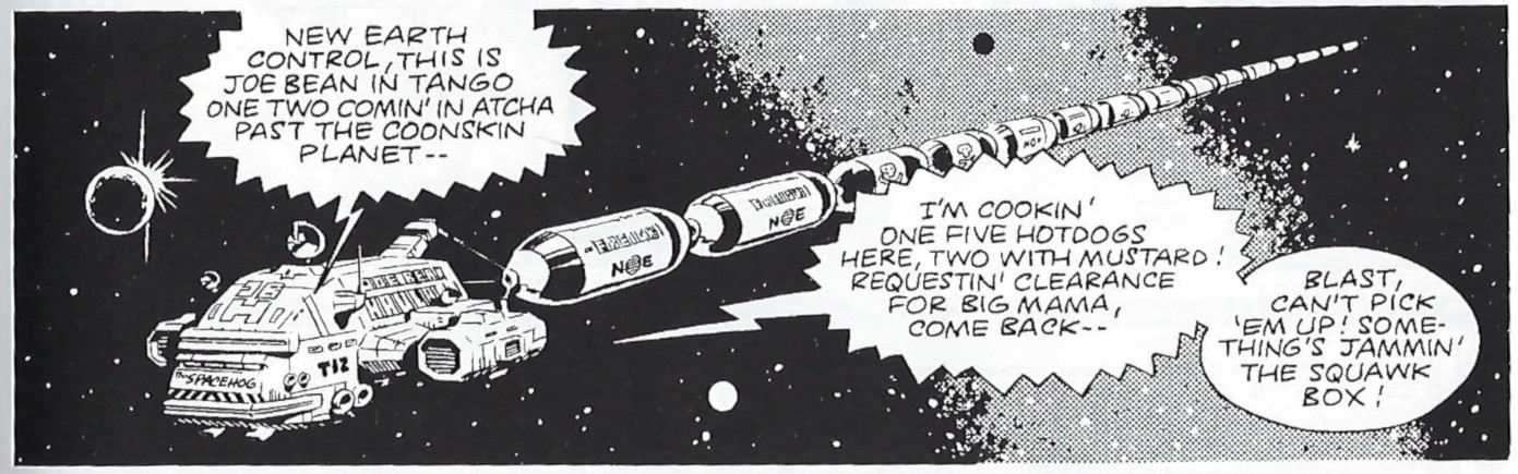
This is the last of the Wagner & Mills collaborations. It starts great, with colorful space truckers named "Joe Bean" and "Babe Roth"! I loved the way Gibbons rendered their space truck in particular. Babe is a single working mum, and we see her dealing with her kids' robot tutor, and struggling with being so far away from them.

Again, it made me think of something RTD would do later on; it reminds one of the comic-booky residents of New Earth in "Gridlock"... and where are these human colonists? The New-Earth System! Russell would have been, what, 16-17 when these strips all came out? I don't think he's ripping them off or even deliberating pastiching them, so much as it feels like they were absorbed into his bones as part of the fundamentals of How Doctor Who Works. Like how if someone hired me to make Doctor Who, I would make it like the 2001-02 Paul McGann audios without even meaning to.

After a strong start, though, it becomes the weakest of the Wagner & Mills joints once the Daleks turn up. Gibbons draws a mean Dalek, of course, and I derive sheer joy from seeing K-9 explode one, but running around on a Dalek ship as they carry out a typically inscrutable plot just isn't as imaginative as the stuff this comic has done up until now. The climax of the story is well-orchestrated, but in the middle I found myself getting bored for the first time in this series.

Sharon gets a space jumpsuit in this story, which makes her look very leggy. How old is she supposed to be, anyhow? Like, fourteen? Anyway, she doesn't really get much to do here; the installments are so short, and she spends much of it away from the Doctor while he fights the Daleks with K-9 and a hypnotized werewolf. The idea of Sharon is great, but she's not up to much in the execution.
from Doctor Who Weekly #38
The Time Witch, from Doctor Who Weekly #35-38 (June-July 1980)
written by Steve Moore, artwork & lettering by Dave Gibbons 

Steve Moore takes over as writer here, in a story that introduces a number of changes. It's shorter (just four parts, instead of eight), Sharon gets a new haircut (that's good), and Sharon is aged up by four years! To be honest, having already read the rest of Sharon's appearances in Dragon's Claw, I'm not sure why this was done; Sharon never does anything at 18(?) that she couldn't have done at 14(?), except for how she was written out. I'm also not convinced that Gibbons draws her very differently, given how she already looked in stories like Dogs of Doom!

In this one, it's a mental battle of wills between the Doctor and a woman called the "time witch." I don't much like stories of that sort, in that it seems like anything can happen, but this one has some clever touches and decently defined rules. It's fine, but nothing special.
Stray Observations:

  • The village where The Iron Legion opens will eventually be established as Stockbridge, the village from the fifth Doctor comics. The Tardis wiki tells me this happens in The Stockbridge Child, but I am pretty sure Alan Barnes's script for the Big Finish audio adaptation also includes this retcon.
  • Another bit that feels very RTD to me is where the Doctor is running alphabetically through aliens before he remembers the ecto-slime and its weakness. Russell totally poached this for "World War Three"!
  • In The Star Beast, the Doctor proves he's a good guy to the Wrarth by showing them a medal he received for defeating the Cybermen: it has a picture of a Cyberman's head with an "X" over it! When was this issued to him and by whom?
  • At one point, a Dalek calls the Doctor a "fool." This just doesn't seem very Dalek-y to me.
  • Fact fans should note that Mills and Wagner would come up with the strip ideas together (I think all or most actually began life as pitches to the television series; one unproduced pitch of theirs would eventually become the Big Finish audio The Song of the Megaptera), they alternated on the actual writing; the "Mills & Wagner" ones are by Mills, while the "Wagner & Mills" ones are by Wagner. I do think there's a difference of tone. The two Mills ones are a bit... wackier? That seems to imply comedy. Maybe "colorful" is a better word. The two Wagner ones are a bit grimmer. Though both balance both aspects!
  • Pat Mills went on to write a couple Doctor Who audio dramas; in addition to the Megaptera "Lost Story," he would also write a couple "New Eighth Doctor Adventures," including The Scapegoat, which was a lot like these stories in its sheer energy. John Wagner is most famous as co-creator of Judge Dredd, but around these parts we best know him as co-writer of DC sf epic Bob the Galactic Bum!
This post is the first in a series about the Doctor Who Magazine comic strip and Marvel UK. The next installment covers Dragon's Claw.

08 February 2021

Review: Doctor Who: The Then and the Now by Si Spurrier & Rob Williams, Simon Fraser, and Warren Pleece

Collection published: 2016
Contents originally published: 2015-16
Acquired: September 2018
Read: December 2020

Doctor Who: The Eleventh Doctor, Vol 4: The Then and the Now

Writers: Si Spurrier & Rob Williams
Artists:
Simon Fraser, Warren Pleece
Colorist:
Gary Caldwell

Letters: Richard Starkings and Jimmy Betancourt

This volume solidified my belief that The Eleventh Doctor is far and above the best of Titan's three ongoing Doctor Who comics. Alice continues on as a companion from "Year One," but two more are added: the Squire and Abslom Daak of Doctor Who Magazine fame.

The invocation of Daak is more than a surface-level continuity thing; I actually think it reveals something important about the creative team's intentions. Coincidentally, I started reading through the Panini collections of the DWM comic strip around the same time I started this, and The Then and the Now reminds me of the classic fourth Doctor run by Pat Mills, John Wagner, and Dave Gibbons (I haven't actually gotten to Daak yet; his material is reprinted in one of the seventh Doctor volumes) in that it doesn't read like an attempt to imitate what the tv show does in comics form, but instead it takes what the tv show does and filters it through a comics prism. Si Spurrier and Rob Williams and their artistic collaborators are doing their own thing that draws on stuff the tv show did... but is really nothing like it in terms of tone and affect.

The story focuses on the eleventh Doctor's guilt over what he did as the "War Doctor" during the Time War; he's being hunted by a bounty hunter (the Then and the Now of the title) for a crime he doesn't remember committing... but is perfectly willing to believe he committed. He and Alice are joined by the Squire, a companion of the War Doctor he doesn't remember, and Abslom Daak, who finds himself at loose ends as a "Dalek killer" with no Daleks to kill. Each story here sees the Doctor retracing his steps through the Time War as Alice has strange visions ("EXTERMINHATE") and we get glimpses of the War Doctor and a mysterious child. There's lots of great stuff here, both horrifying and gentle, and never for a moment do you feel like you're watching the tv show. I like this portrayal of a guilt-wracked Doctor; I like the new weird TARDIS team he has inadvertently assembled; I like the guesses and glimpses we get of the Time War (once again demonstrating that Big Finish Time War is the least interesting Time War). My only complaint would be that Alice herself feels a bit lost in the epic Doctor angst of it all, compared to how much her character was foregrounded in "Year One" (her visions feels more like a plot device than a character point), but I am hopeful that future volumes in "Year Two" will remedy this.

I read an issue of Titan's Doctor Who comic every day (except when I have hard-copy comics to read). Next up in sequence: The Eighth Doctor: A Matter of Life and Death

05 February 2021

Quarantined!

I had intended to run another (and final? possibly penultimate) "Font Friday" installment today, but life got away from over the past two weeks... because Son One was quarantined!

Last Monday we got word that one of his daycare instructors had tested positive for COVID-19, so the whole daycare had to be shut down for two weeks so all students and staff could quarantine. He's shown no symptoms, so we're not really worried... but this does mean that he has to spend two weeks at home when my wife spends most of her time tethered to an infant. So on days where I work from home, I work in small bits while spending much of time time trying to keep Son One entertained, and especially getting him outside where possible. My goals of getting work back to my students promptly this semester-- out the window right at the start of week two! (On the other hand, he Zoombombed three of my four Friday classes last week. I wonder how he'll do this week?)

So no time to do a deep dive on the new logo used on Star Trek: Deep Space Nine novels after the series ended. Instead, here are some cute Son One stories:

  • We went walking one day-- he was riding his toy tractor-- and were going down a parallel street to ours when he saw a kid playing with trucks on the driveway. (The other kid was two, six months younger than him.) In his classic mode, he began insisting those were his trucks. We moved on, but he suddenly began insisting that he had a digger, and he hopped off his tractor to drive his imaginary digger around on the sidewalk. We resumed walking eventually (I carried the tractor because he didn't want to ride it anymore), but he held his hand out, palm up, to carry the digger, and I soon realized he was holding both hands thus, because the other one had a loader in it. When we crossed the road, he would touch his hands together, and it dawned on me that he was putting both trucks in the same hand so he could hold my hand with the empty one! He eventually did resume riding the tractor... but without holding onto the steering wheel so that he could continue to carry his digger and his loader!
  • He likes to refer to himself and his brother as "brothers"; like, he'll give the baby some Duplo and then declare "Brothers are sharing Duplo." I think it's pretty funny when he refers to himself as "this brother" and the baby as "that brother": "This brother is eating egg noodles, and that brother is eating milk."
  • One of the things that drives me crazy is that though he always enjoys going outsideide, you really have to cajole him outside in the first place almost every time. One time I did it by telling him he could bring his "Mama Duck" along; she rode along in his pocket.
  • I helped him swaddled one of his Star Trek baby toys; he promptly held it up to his chest and because walking around going "sss sss sss" in imitation of the way I shush the baby. He already knows the 5 S's!
  • Him to me, unprompted while eating yogurt for dinner: "I'm just a kid who eats yogurt."

It's been exhausting and, um, I am excited for him to go back to daycare so that the house can look slightly less like a Duplo bomb has gone off in it (actually, we are pretty good about cleaning up the Duplo every night; it's the cookbooks in random places on the floor that are obnoxious), but the past 6-8 weeks have really seen some big jumps in his abilities with language and with imaginative play, and it has been a delight to watch.


03 February 2021

Review: Passing by Nella Larsen

Originally published: 1929
Read: October 2020

Passing by Nella Larsen

I remember reading and liking Quicksand in college, so I was interested enough in Passing to pluck it off my wife's bookshelf. (At 122 pages, including notes, it was hardly going to slow down my reading!) This was very good too, a tale of a black woman who sometimes "passes" in public (to, say, go to a nice restaurant) interacting with another one who spends all her time passing-- even with her white, racist husband! The latter wants to be friends, the former begins to build up a resentment. "Enjoy" seems like the wrong word for a book like this, but I really liked it; Larsen uses the techniques of modernist prose to her advantage, and the book builds up some interesting complexities and sharply observed moments before a highly effective ending.

01 February 2021

Reading Roundup Wrapup: January 2021

Pick of the month: Twelve Angels Weeping by Dave Rudden. I read some good stuff this month, but the clear standout was this collection of dark Doctor Who Christmas tales. I've read a lot of Doctor Who Christmas books by this point, but this one was clearly one of the best.

All books read:
1. Nicholas Nickleby by Charles Dickens
2. Altered Carbon by Richard K. Morgan
3. Doctor Who: Twelve Angels Weeping by Dave Rudden
4. The Transformers Classics UK, Volume Two by Simon Furman, et al.
5. The Man with the Golden Gun by Ian Fleming
6. Auberon: An Expanse Novella by James S.A. Corey
7. The Hero of Ages: Book Three of Mistborn by Brandon Sanderson
8. Voyager: Collected Comic Strips from the Pages of The Official Doctor Who Magazine by John Ridgway, Steve Parkhouse, and Alan McKenzie
9. Star Trek: Picard: The Dark Veil by James Swallow
10. The NeuroGeneration: The New Era in Brain Enhancement That Is Revolutionizing the Way We Think, Work, and Heal by Tan Le
11. Doctor Who Magazine: Special Edition #55: Production Design edited by Marcus Hearn
12. The Transformers Classics UK, Volume Three by Simon Furman, Jeff Anderson, et al.
13. Narn i Chîn Húrin: The Tale of the Children of Húrin by J. R. R. Tolkien
14. The World Shapers: Collected Comic Strips from the Pages of Doctor Who Magazine by John Ridgway, Grant Morrison, Jamie Delano, et al. 

A good month! The key, of course, is to alternate your Brandon Sanderson and J. R. R. Tolkien door-stoppers with lots of tie-in comics.

All books acquired:
1. Star Trek: Picard: The Dark Veil by James Swallow
2. Mistress of Chaos: Collected comic strips from the pages of Doctor Who Magazine by Scott Gray, John Ross, Mike Collins, and David A Roach
3. Art & Lies: A Piece for Three Voices and a Bawd by Jeanette Winterson
4. Justice Society of America: The Demise of Justice by Len Strazewski, Grant Miehm, Mike Parobeck, Tom Artis, Rick Burchett, et al.
5. Blindsight by Peter Watts

All books on "To be read" list: 661 (down 1)

29 January 2021

Double Diagnosis

from The Tampa Bay Times
I got a postcard in the mail over break from the Moffitt Cancer Center, addressed to "RESIDENT" at my address, saying I could get $25 for taking a COVID antibody test as part of a study. "Why not?" I thought, and I signed up. The deal was that they wanted to monitor how the antibodies lasted, so you got $25 for the first visit, and then if you were positive, you would have two follow-up visits, and get $50 each for those.

We've been pretty locked down here since March. I do go out once a week to shop for groceries, and I run the occasional other errand, and of course I teach on campus twice per week, but that's it. Before her maternity leave began, Hayley did teach at her school, but only one of her classes was in person. We took a trip for Thanksgiving, but never came close to other people except briefly outdoors. We had some people over back in October, but everyone stayed six feet apart outside. We have had some visitors since our second son was born, but they were all people who have been pretty careful themselves. That seems like a lot now that I list it out (and I feel like there are a couple things I am forgetting), but it's not much social contact for ten months! And we have been avoiding the major dangers: no eating at restaurants, no large social gatherings, and so on.

So could I have caught COVID? None of us had ever had any symptoms if so. Getting my blood drawn was a pretty painless experience (the researcher: "I've having trouble finding a big vein. Did you drink water this morning?" me: "Only coffee." her: "That's the opposite of what I need!"), and after just under a week I got the e-mail with my results.

I am negative for antibodies.

Hayley asked me if I had wanted to have had it. I thought about this and a couple days later realized, kind of, yes. But not because it would mean I was immune (probably) now. Because it would mean that I was so strong my body had fought it off without me even knowing! As we all know, the strength of your immune system is an indication of your moral fitness.


Back in November, I started to realize I could hear the noise wherever I went.

I don't know exactly when I first noticed it; sometime over the summer, I think. In quiet moments, sitting on the living room couch after Little Buddy had gone to bed, I would hear a faint (I thought) electronic whine. I assumed it was a lightbulb (the lightbulbs above the living couch burn out every six months, so clearly there is some kind of issue there) or maybe my computer's charger or something. I couldn't hear it most of the time, so I didn't worry about it.

But in November, I started to realize that I was always hearing that noise, whether I was sitting on the couch or not. So I started paying attention to it, and discovered that it was always with me. A very faint, very high-pitched whine, only in my left ear. It seemed unlikely to me that I had a bad lightbulb in my car and my office and outside, too. I remember I told Hayley about driving up to our Thanksgiving cottage, and she spent the car trip googling tinnitus.

I see my primary care doctor every January just before the semester starts, so I saved the thought until then, though I needn't have bothered, since all he did was say, "go see a specialist."

I did that this past Tuesday. First I had my hearing tested by an audiologist. This was pretty neat; they put you in a soundproof booth with headphones on and play lots of tones and words at you. She said I had some very slight damage in the high frequencies in my left ear.

The physician actually said I had beautiful hearing and he was jealous. And he confirmed that yes, I do have tinnitus. ("Tin-i-tus, or as it's known on the street, ti-nai-tus.") But I don't have significant hearing loss, I don't any related issues like dizziness or vertigo, and basically there is nothing that can be done. He did say a low-salt diet might help, but that otherwise my best bet is to just keep the environment from being too quiet so it doesn't annoy me too much. I should come back if my symptoms got worse, and thankfully we now had a baseline hearing test for me so we could tell if I began to suffer hearing loss.

I have heard of many people where tinnitus impacts their quality of life negatively. (William Shatner got tinnitus during the filming of the Star Trek episode "Arena," as did Leonard Nimoy.) I think it would take a big amplification of the noise for that to happen to me, thankfully, but I will keep an ear out!

27 January 2021

Review: NeuroGeneration by Tan Le

Published: 2020
Read: January 2021

The NeuroGeneration: The New Era in Brain Enhancement That Is Revolutionizing the Way We Think, Work, and Heal
by Tan Le

Tan Le is an entrepreneur in the area of brain-computer interface; this is a quick-reading overview of where attempts to alter the human brain stand in a number of different areas. She writes chapters on topics such nootropics, brain-computer interfaces, bionics, cyborg implants, AI, and cellular brain repair. Despite Le's personal investment in this area, it kind of feel like a series of breathless pop-science articles you might read in, I dunno, Wired. Plenty of breadth but I don't think much depth; two very short chapters cover the "risks and ethical dilemmas." (I did find the discussion of the lack of diversity in neural imaging research interesting.) There's lots of potential, but to a degree one wonders if we're really on the verge of a breakthrough revolution like Le says, or if this is a lot of technological hype that won't go anywhere. I don't think she penetrates deep enough to answer that question. I did think she had a thoroughly sensible take on AI, which was nice, and there was definitely enough neat stuff in here that I hadn't know to make it all worthwhile.

25 January 2021

Review: The Expanse: Persepolis Rising by James S.A. Corey

Originally published: 2017
Acquired and read: October 2020

Persepolis Rising: Book Seven of The Expanse
by James S.A. Corey

After I found the middle trilogy of The Expanse a bit rough, the opening book of the final trilogy is a return to form. Humanity is increasingly an interstellar civilization, but that comes under threat as General Duarte and the Laconian Navy return through the gate they vanished across so many years ago-- now with fantastic destructive powers in their hands, thanks to their use of the protomolecule. The book alternates between the Laconian occupation of Medina Station (where the Rocinante crew get caught out) and a wider vision of the Laconian invasion of the solar system (as they crush Earth, Martian, and Belter resistance).

Like the best of The Expanse books, this one balances character, action, and engaging plot twists; despite its large size, I read it quickly, and I found it more engaging than any Expanse novels since Abaddon's Gate. While I wouldn't say the middle books had to be the way they were, one can see how the set-up they did is paying off as The Expanse moves toward a climax and a conclusion. The book is suspenseful; Holden and the Rocinante crew work best when they're on the back foot, scrappy underdogs trying to push their way out of situations so complex as to be beyond the capacity of a handful of cargo haulers, and that really comes across here as they have to figure out how to deal with an occupying force. Lots of good character moments, lots of clever action. I was a big fan of Singh's arc, the commander of the occupying forces. The Expanse is back, and I ended the book hyped for number eight.

One quibble, though, and I can't decide if it's a big quibble or a little quibble. There's a thirty-year jump between this book and the last! I'm fine with that on principle, but Holden and the other Rocinante crewmembers aren't written like sixty-somethings, they're still written like thirty-somethings. In terms of characterization, it's like they were all held in stasis for those three decades. Clarissa, for example, still comes across as someone they barely know, even though they've literally spent half their lives working with her! It just totally fails to convince, and was seemingly only done for plot reasons: Laconia needed three decades to develop to the point where it could threaten the solar system. I feel like a more sfnal solution could have been found, protomolecule time shenanigans or something. But as annoying as it is, once the book gets underway, you basically stop thinking about it, so they kind of get away with it? Like I said, I don't know if it's a little quibble or a big quibble.

One last thing, mostly an observation. The character of Drummer was technically in the first couple books, but she was really just a passing reference. She debuted on season 2 of the television program (2017), and over the next couple years her role got bigger and bigger because the actress who plays her (Cara Gee) was so good they wanted to give her more to do; Drummer replaces roles played by different characters in books three and five. Persepolis Rising was the first book to be written after season 2 went into production, and suddenly Drummer has a huge role in it, one of those moments where the adaptation feeds back into the original. And it's easy to see how the show could maneuver the character to be in the same position as the book one by this point in time, so the two versions who had somewhat different stories would end up converging into one! Neat. (Except that between when I finished Persepolis Rising and wrote this review, it was announced that The Expanse would come back for a sixth season, but not a seventh, so there never will be a tv version of these events. Oh well.)

I read an Expanse story every eighty-ish days. Next up in sequence: Auberon